
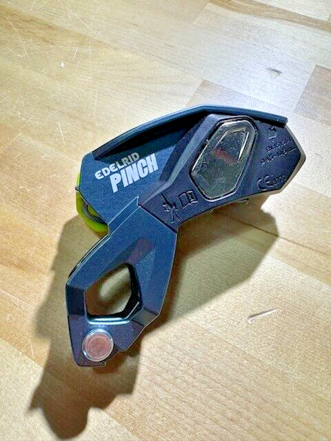
Edelrid Pinch Assisted Belay Device - Rock Climbing, Sport, Trad, Send it!
Check the listing for details.


| Location | Chattanooga US |
| Shipping | Free shipping (check listing for details) |
| Seller |
elevatedclimbing
100.0% positive · 1199 feedback
|
| Listing | FixedPrice · Active |
| Start time | 2024-11-30T14:10:55.000Z |
| Brand | Edelrid |
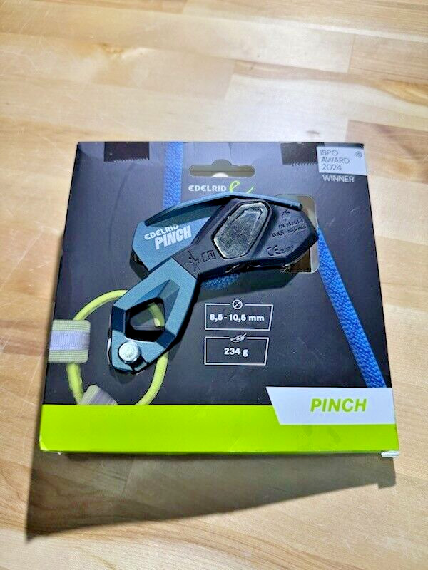
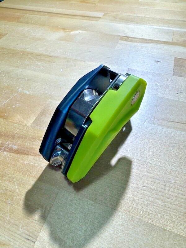
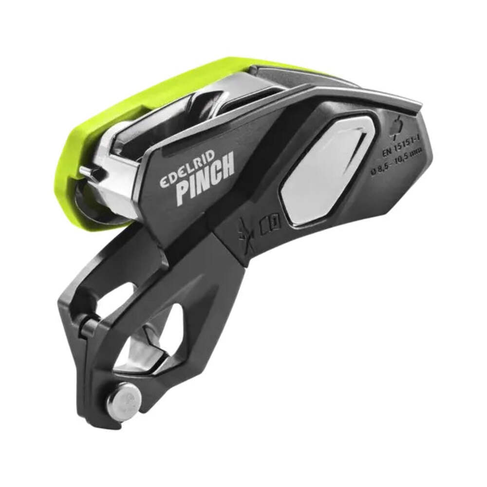
Edelrid Pinch Assisted Belay Device - Rock Climbing, Sport, Trad, Send it! Edelrid Pinch Semi Automatic Belay Devices Art. no. 738380008150 Weight 234 g Pinch - a new belaying experience with the PINCH, a new, versatile assisted braking belay device for use in sport climbing, multi-pitch climbing and rope access techniques. The PINCH is the first device on the market that can be attached directly to the central ring of the climbing harness. Thanks to its low, close-to-the-body position, the PINCH does not need to be fixed in place when releasing the rope and the brake rope can always be gripped with all fingers. In addition, the compact belay system provides an increased span, which allows the belayer to pay out 20 - 30 cm more rope at once. The linear rope run through the frontal steel braking grooves reduces rope tangles when lowering and abseiling. In addition to the release lever, the speed can be controlled by the pressure of the braking hand, which contributes to increased braking rope control, especially when using thin, soft ropes. The anti-panic function provides added safety not only for beginners. A special feature is the integrated second braking tier, which enables controlled lowering by pulling the lowering lever further when securing particularly light persons or in systems with high rope friction. Users and experienced rope access technicians can permanently deactivate the anti-panic function using a screw supplied. Another plus: When used on multi-pitch lengths, the PINCH is the only device on the market that can be attached to the belay station in four different directions in 90° increments. This means that the belay lever can always be brought into a position in which it can be operated freely. Features Assisted braking belay device for versatile use in sport climbing, multi-pitch climbing and rope access techniques Position close to the body due to direct harness connection increases brake rope control and improves usability Direct harness connection eliminates the risk of cross-loading the belay carabiner Anti-panic function can be deactivated for increased safety by automatically locking the device if the release lever is pulled too far backwards Second braking tier if the anti-panic function is activated too frequently due to insufficient load and/or excessive rope friction Frontal steel brake grooves allow the rope to run linearly and ensure less rope tangling, increased durability and prevent unsightly discoloration that occurs when the rope rubs against aluminium Attachment to the stand in four different directions in 90° increments Equal operation for right and left-handed users Suitable for static ropes from 10.0 to 10.5 mm diameter (120 kg max. user weight) Suitable for dynamic ropes from 8.5 to 10.5 mm diameter Technical Information UIAA Approved rope diameter: 8,5 - 10,5 mm Certification : EN 15151-1 Certification : EN 12841-C
Material : Steel/ALU Mechanical Downloads User manual Pinch EU Declaration of Conformity Pinch EU Declaration of Conformity Sample Pinch EN 15151-1 Inspection Instruction Belay Devices elm.clearfix .clearfix:before,.clearfix:after .clearfix:after .hide-text .input-block-level article,aside,details,figcaption,figure,footer,header,hgroup,nav,section audio,canvas,video audio:not([controls]) html a:focus a:hover,a:active sub,sup sup sub img #map_canvas img,.google-maps img button,input,select,textarea button,input button::-moz-focus-inner,input::-moz-focus-inner button,html input[type="button"],input[type="reset"],input[type="submit"] label,select,button,input[type="button"],input[type="reset"],input[type="submit"],input[type="radio"],input[type="checkbox"] input[type="search"] input[type="search"]::-webkit-search-decoration,input[type="search"]::-webkit-search-cancel-button textarea @media print a,a:visited a[href]:after abbr[title]:after .ir a:after,a[href^="js:"]:after,a[href^="#"]:after pre,blockquote thead tr,img img @page p,h2,h3 h2,h3 }body a a:hover,a:focus .img-rounded .img-polaroid .img-circle .row .row:before,.row:after .row:after [class*="span"] .container,.navbar-static-top ,.navbar-fixed-top ,.navbar-fixed-bottom .span12 .span11 .span10 .span9 .span8 .span7 .span6 .span5 .span4 .span3 .span2 .span1 .offset12 .offset11 .offset10 .offset9 .offset8 .offset7 .offset6 .offset5 .offset4 .offset3 .offset2 .offset1 .row-fluid .row-fluid:before,.row-fluid:after .row-fluid:after .row-fluid [class*="span"] .row-fluid [class*="span"]:first-child .row-fluid [class*="span"]+[class*="span"] .row-fluid .row-fluid .row-fluid .row-fluid .row-fluid .row-fluid .row-fluid .row-fluid .row-fluid .row-fluid .row-fluid .row-fluid .row-fluid .row-fluid .row-fluid .row-fluid .row-fluid .row-fluid .row-fluid .row-fluid .row-fluid .row-fluid .row-fluid .row-fluid .row-fluid .row-fluid .row-fluid .row-fluid .row-fluid .row-fluid .row-fluid .row-fluid .row-fluid .row-fluid .row-fluid .row-fluid [class*="span"].hide,.row-fluid [class*="span"].hide [class*="span"].pull-right,.row-fluid [class*="span"].pull-right .container .container:before,.container:after .container:after .container-fluid .container-fluid:before,.container-fluid:after .container-fluid:after p .lead small strong em cite .muted a.muted:hover,a.muted:focus .text-warning a.text-warning:hover,a.text-warning:focus .text-error a.text-error:hover,a.text-error:focus .text-info a.text-info:hover,a.text-info:focus .text-success a.text-success:hover,a.text-success:focus .text-left .text-right .text-center h1,h2,h3,h4,h5,h6 h1 small,h2 small,h3 small,h4 small,h5 small,h6 small h1,h2,h3 h1 h2 h3 h4 h5 h6 h1 small h2 small h3 small h4 small .page-header ul,ol ul ul,ul ol,ol ol,ol ul li ul.unstyled,ol.unstyled ul.inline,ol.inline ul.inline>li,ol.inline>li dl dt,dd dt dd .dl-horizontal .dl-horizontal:before,.dl-horizontal:after .dl-horizontal:after .dl-horizontal dt .dl-horizontal dd hr abbr[title],abbr[data-original-title] abbr.initialism blockquote blockquote p blockquote small blockquote small:before blockquote.pull-right blockquote.pull-right p,blockquote.pull-right small blockquote.pull-right small:before blockquote.pull-right small:after q:before,q:after,blockquote:before,blockquote:after address code,pre code pre pre.prettyprint pre code .pre-scrollable form fieldset legend legend small label,input,button,select,textarea input,button,select,textarea label select,textarea,input[type="text"],input[type="password"],input[type="datetime"],input[type="datetime-local"],input[type="date"],input[type="month"],input[type="time"],input[type="week"],input[type="number"],input[type="email"],input[type="url"],input[type="search"],input[type="tel"],input[type="color"],.uneditable-input input,textarea,.uneditable-input textarea textarea,input[type="text"],input[type="password"],input[type="datetime"],input[type="datetime-local"],input[type="date"],input[type="month"],input[type="time"],input[type="week"],input[type="number"],input[type="email"],input[type="url"],input[type="search"],input[type="tel"],input[type="color"],.uneditable-input textarea:focus,input[type="text"]:focus,input[type="password"]:focus,input[type="datetime"]:focus,input[type="datetime-local"]:focus,input[type="date"]:focus,input[type="month"]:focus,input[type="time"]:focus,input[type="week"]:focus,input[type="number"]:focus,input[type="email"]:focus,input[type="url"]:focus,input[type="search"]:focus,input[type="tel"]:focus,input[type="color"]:focus,.uneditable-input:focus input[type="radio"],input[type="checkbox"] input[type="file"],input[type="image"],input[type="submit"],input[type="reset"],input[type="button"],input[type="radio"],input[type="checkbox"] select,input[type="file"] select select[multiple],select[size] select:focus,input[type="file"]:focus,input[type="radio"]:focus,input[type="checkbox"]:focus .uneditable-input,.uneditable-textarea .uneditable-input .uneditable-textarea input:-moz-placeholder,textarea:-moz-placeholder input:-ms-input-placeholder,textarea:-ms-input-placeholder input::-webkit-input-placeholder,textarea::-webkit-input-placeholder .radio,.checkbox .radio input[type="radio"],.checkbox input[type="checkbox"] .controls>.radio:first-child,.controls>.checkbox:first-child .radio.inline,.checkbox.inline .radio.inline+.radio.inline,.checkbox.inline+.checkbox.inline .input-mini .input-small .input-medium .input-large .input-xlarge .input-xxlarge input[class*="span"],select[class*="span"],textarea[class*="span"],.uneditable-input[class*="span"],.row-fluid input[class*="span"],.row-fluid select[class*="span"],.row-fluid textarea[class*="span"],.row-fluid [class*="span"] .input-append input[class*="span"],.input-append [class*="span"],.input-prepend input[class*="span"],.input-prepend [class*="span"],.row-fluid input[class*="span"],.row-fluid select[class*="span"],.row-fluid textarea[class*="span"],.row-fluid [class*="span"],.row-fluid [class*="span"],.row-fluid [class*="span"] input,textarea,.uneditable-input .controls-row [class*="span"]+[class*="span"] input.span12,textarea.span12,.uneditable-input.span12 input.span11,textarea.span11,.uneditable-input.span11 input.span10,textarea.span10,.uneditable-input.span10 input.span9,textarea.span9,.uneditable-input.span9 input.span8,textarea.span8,.uneditable-input.span8 input.span7,textarea.span7,.uneditable-input.span7 input.span6,textarea.span6,.uneditable-input.span6 input.span5,textarea.span5,.uneditable-input.span5 input.span4,textarea.span4,.uneditable-input.span4 input.span3,textarea.span3,.uneditable-input.span3 input.span2,textarea.span2,.uneditable-input.span2 input.span1,textarea.span1,.uneditable-input.span1 .controls-row .controls-row:before,.controls-row:after .controls-row:after .controls-row [class*="span"],.row-fluid [class*="span"] .controls-row [class*="span"],.controls-row [class*="span"] input[disabled],select[disabled],textarea[disabled],input[readonly],select[readonly],textarea[readonly] input[type="radio"][disabled],input[type="checkbox"][disabled],input[type="radio"][readonly],input[type="checkbox"][readonly] .control-group.warning ,.control-group.warning ,.control-group.warning .control-group.warning ,.control-group.warning ,.control-group.warning input,.control-group.warning select,.control-group.warning textarea .control-group.warning input,.control-group.warning select,.control-group.warning textarea .control-group.warning input:focus,.control-group.warning select:focus,.control-group.warning textarea:focus .control-group.warning ,.control-group.warning .control-group.error ,.control-group.error ,.control-group.error .control-group.error ,.control-group.error ,.control-group.error input,.control-group.error select,.control-group.error textarea .control-group.error input,.control-group.error select,.control-group.error textarea .control-group.error input:focus,.control-group.error select:focus,.control-group.error textarea:focus .control-group.error ,.control-group.error .control-group.success ,.control-group.success ,.control-group.success .control-group.success ,.control-group.success ,.control-group.success input,.control-group.success select,.control-group.success textarea .control-group.success input,.control-group.success select,.control-group.success textarea .control-group.success input:focus,.control-group.success select:focus,.control-group.success textarea:focus .control-group.success ,.control-group.success .control-group.info ,.control-group.info ,.control-group.info .control-group.info ,.control-group.info ,.control-group.info input,.control-group.info select,.control-group.info textarea .control-group.info input,.control-group.info select,.control-group.info textarea .control-group.info input:focus,.control-group.info select:focus,.control-group.info textarea:focus .control-group.info ,.control-group.info input:focus:invalid,textarea:focus:invalid,select:focus:invalid input:focus:invalid:focus,textarea:focus:invalid:focus,select:focus:invalid:focus .form-actions .form-actions:before,.form-actions:after .form-actions:after .help-block,.help-inline .help-block .help-inline .input-append,.input-prepend .input-append input,.input-prepend input,.input-append select,.input-prepend select,.input-append ,.input-prepend ,.input-append ,.input-prepend ,.input-append ,.input-prepend .input-append input,.input-prepend input,.input-append select,.input-prepend select,.input-append ,.input-prepend .input-append input:focus,.input-prepend input:focus,.input-append select:focus,.input-prepend select:focus,.input-append ,.input-prepend .input-append ,.input-prepend .input-append ,.input-prepend ,.input-append ,.input-prepend ,.input-append >.dropdown-toggle,.input-prepend >.dropdown-toggle .input-append ,.input-prepend .input-prepend ,.input-prepend .input-prepend ,.input-prepend .input-append input,.input-append select,.input-append .input-append input+.btn-group ,.input-append select+.btn-group ,.input-append +.btn-group .input-append ,.input-append ,.input-append .input-append ,.input-append ,.input-append >.dropdown-toggle .input-prepend.input-append input,.input-prepend.input-append select,.input-prepend.input-append .input-prepend.input-append input+.btn-group ,.input-prepend.input-append select+.btn-group ,.input-prepend.input-append +.btn-group .input-prepend.input-append ,.input-prepend.input-append .input-prepend.input-append ,.input-prepend.input-append .input-prepend.input-append input.search-query .form-search ,.form-search .form-search .form-search .form-search .form-search .form-search input,.form-inline input,.form-horizontal input,.form-search textarea,.form-inline textarea,.form-horizontal textarea,.form-search select,.form-inline select,.form-horizontal select,.form-search ,.form-inline ,.form-horizontal ,.form-search ,.form-inline ,.form-horizontal ,.form-search ,.form-inline ,.form-horizontal ,.form-search ,.form-inline ,.form-horizontal .form-search ,.form-inline ,.form-horizontal .form-search label,.form-inline label,.form-search ,.form-inline .form-search ,.form-inline ,.form-search ,.form-inline .form-search ,.form-search ,.form-inline ,.form-inline .form-search input[type="radio"],.form-search input[type="checkbox"],.form-inline input[type="radio"],.form-inline input[type="checkbox"] .control-group legend+.control-group .form-horizontal .form-horizontal ,.form-horizontal .form-horizontal .form-horizontal .form-horizontal .form-horizontal .form-horizontal .form-horizontal input+.help-block,.form-horizontal select+.help-block,.form-horizontal textarea+.help-block,.form-horizontal +.help-block,.form-horizontal +.help-block,.form-horizontal +.help-block .form-horizontal table .table .table th,.table td .table th .table thead th .table caption+thead tr:first-child th,.table caption+thead tr:first-child td,.table colgroup+thead tr:first-child th,.table colgroup+thead tr:first-child td,.table thead:first-child tr:first-child th,.table thead:first-child tr:first-child td .table tbody+tbody .table .table-condensed th,.table-condensed td .table-bordered .table-bordered th,.table-bordered td .table-bordered caption+thead tr:first-child th,.table-bordered caption+tbody tr:first-child th,.table-bordered caption+tbody tr:first-child td,.table-bordered colgroup+thead tr:first-child th,.table-bordered colgroup+tbody tr:first-child th,.table-bordered colgroup+tbody tr:first-child td,.table-bordered thead:first-child tr:first-child th,.table-bordered tbody:first-child tr:first-child th,.table-bordered tbody:first-child tr:first-child td .table-bordered thead:first-child tr:first-child>th:first-child,.table-bordered tbody:first-child tr:first-child>td:first-child,.table-bordered tbody:first-child tr:first-child>th:first-child .table-bordered thead:first-child tr:first-child>th:last-child,.table-bordered tbody:first-child tr:first-child>td:last-child,.table-bordered tbody:first-child tr:first-child>th:last-child .table-bordered thead:last-child tr:last-child>th:first-child,.table-bordered tbody:last-child tr:last-child>td:first-child,.table-bordered tbody:last-child tr:last-child>th:first-child,.table-bordered tfoot:last-child tr:last-child>td:first-child,.table-bordered tfoot:last-child tr:last-child>th:first-child .table-bordered thead:last-child tr:last-child>th:last-child,.table-bordered tbody:last-child tr:last-child>td:last-child,.table-bordered tbody:last-child tr:last-child>th:last-child,.table-bordered tfoot:last-child tr:last-child>td:last-child,.table-bordered tfoot:last-child tr:last-child>th:last-child .table-bordered tfoot+tbody:last-child tr:last-child td:first-child .table-bordered tfoot+tbody:last-child tr:last-child td:last-child .table-bordered caption+thead tr:first-child th:first-child,.table-bordered caption+tbody tr:first-child td:first-child,.table-bordered colgroup+thead tr:first-child th:first-child,.table-bordered colgroup+tbody tr:first-child td:first-child .table-bordered caption+thead tr:first-child th:last-child,.table-bordered caption+tbody tr:first-child td:last-child,.table-bordered colgroup+thead tr:first-child th:last-child,.table-bordered colgroup+tbody tr:first-child td:last-child .table-striped tbody>tr:nth-child(odd)>td,.table-striped tbody>tr:nth-child(odd)>th .table-hover tbody tr:hover>td,.table-hover tbody tr:hover>th table td[class*="span"],table th[class*="span"],.row-fluid table td[class*="span"],.row-fluid table th[class*="span"] .table td.span1,.table th.span1 .table td.span2,.table th.span2 .table td.span3,.table th.span3 .table td.span4,.table th.span4 .table td.span5,.table th.span5 .table td.span6,.table th.span6 .table td.span7,.table th.span7 .table td.span8,.table th.span8 .table td.span9,.table th.span9 .table td.span10,.table th.span10 .table td.span11,.table th.span11 .table td.span12,.table th.span12 .table tbody tr.success>td .table tbody tr.error>td .table tbody tr.warning>td .table tbody tr.info>td .table-hover tbody tr.success:hover>td .table-hover tbody tr.error:hover>td .table-hover tbody tr.warning:hover>td .table-hover tbody tr.info:hover>td [class^="icon-"],[class*=" icon-"] .icon-white,.nav-pills>.active>a>[class^="icon-"],.nav-pills>.active>a>[class*=" icon-"],.nav-list>.active>a>[class^="icon-"],.nav-list>.active>a>[class*=" icon-"],.navbar-inverse >.active>a>[class^="icon-"],.navbar-inverse >.active>a>[class*=" icon-"],.dropdown-menu>li>a:hover>[class^="icon-"],.dropdown-menu>li>a:focus>[class^="icon-"],.dropdown-menu>li>a:hover>[class*=" icon-"],.dropdown-menu>li>a:focus>[class*=" icon-"],.dropdown-menu>.active>a>[class^="icon-"],.dropdown-menu>.active>a>[class*=" icon-"],.dropdown-submenu:hover>a>[class^="icon-"],.dropdown-submenu:focus>a>[class^="icon-"],.dropdown-submenu:hover>a>[class*=" icon-"],.dropdown-submenu:focus>a>[class*=" icon-"] .icon-glass .icon-music .icon-search .icon-envelope .icon-heart .icon-star .icon-star-empty .icon-user .icon-film .icon-th-large .icon-th .icon-th-list .icon-ok .icon-remove .icon-zoom-in .icon-zoom-out .icon-off .icon-signal .icon-cog .icon-trash .icon-home .icon-file .icon-time .icon-road .icon-download-alt .icon-download .icon-upload .icon-inbox .icon-play-circle .icon-repeat .icon-refresh .icon-list-alt .icon-lock .icon-flag .icon-headphones .icon-volume-off .icon-volume-down .icon-volume-up .icon-qrcode .icon-barcode .icon-tag .icon-tags .icon-book .icon-bookmark .icon-print .icon-camera .icon-font .icon-bold .icon-italic .icon-text-height .icon-text-width .icon-align-left .icon-align-center .icon-align-right .icon-align-justify .icon-list .icon-indent-left .icon-indent-right .icon-facetime-video .icon-picture .icon-pencil .icon-map-marker .icon-adjust .icon-tint .icon-edit .icon-share .icon-check .icon-move .icon-step-backward .icon-fast-backward .icon-backward .icon-play .icon-pause .icon-stop .icon-forward .icon-fast-forward .icon-step-forward .icon-eject .icon-chevron-left .icon-chevron-right .icon-plus-sign .icon-minus-sign .icon-remove-sign .icon-ok-sign .icon-question-sign .icon-info-sign .icon-screenshot .icon-remove-circle .icon-ok-circle .icon-ban-circle .icon-arrow-left .icon-arrow-right .icon-arrow-up .icon-arrow-down .icon-share-alt .icon-resize-full .icon-resize-small .icon-plus .icon-minus .icon-asterisk .icon-exclamation-sign .icon-gift .icon-leaf .icon-fire .icon-eye-open .icon-eye-close .icon-warning-sign .icon-plane .icon-calendar .icon-random .icon-comment .icon-magnet .icon-chevron-up .icon-chevron-down .icon-retweet .icon-shopping-cart .icon-folder-close .icon-folder-open .icon-resize-vertical .icon-resize-horizontal .icon-hdd .icon-bullhorn .icon-bell .icon-certificate .icon-thumbs-up .icon-thumbs-down .icon-hand-right .icon-hand-left .icon-hand-up .icon-hand-down .icon-circle-arrow-right .icon-circle-arrow-left .icon-circle-arrow-up .icon-circle-arrow-down .icon-globe .icon-wrench .icon-tasks .icon-filter .icon-briefcase .icon-fullscreen .dropup,.dropdown .dropdown-toggle .dropdown-toggle:active,.open .caret .dropdown .dropdown-menu .dropdown-menu.pull-right .dropdown-menu .dropdown-menu>li>a .dropdown-menu>li>a:hover,.dropdown-menu>li>a:focus,.dropdown-submenu:hover>a,.dropdown-submenu:focus>a .dropdown-menu>.active>a,.dropdown-menu>.active>a:hover,.dropdown-menu>.active>a:focus .dropdown-menu>.disabled>a,.dropdown-menu>.disabled>a:hover,.dropdown-menu>.disabled>a:focus .dropdown-menu>.disabled>a:hover,.dropdown-menu>.disabled>a:focus .open .open>.dropdown-menu .dropdown-backdrop .pull-right>.dropdown-menu .dropup ,.navbar-fixed-bottom .dropup ,.navbar-fixed-bottom .dropdown-submenu .dropdown-submenu>.dropdown-menu .dropdown-submenu:hover>.dropdown-menu .dropup >.dropdown-menu .dropdown-submenu>a:after .dropdown-submenu:hover>a:after .dropdown-submenu.pull-left .dropdown-submenu.pull-left>.dropdown-menu .dropdown .typeahead .well .well blockquote .well-large .well-small .fade .fade.in .collapse .collapse.in .close .close:hover,.close:focus button.close .btn .btn:hover,.btn:focus,.btn:active,.btn.active,.btn.disabled,.btn[disabled] .btn:active,.btn.active .btn:first-child .btn:hover,.btn:focus .btn:focus .btn.active,.btn:active .btn.disabled,.btn[disabled] .btn-large .btn-large [class^="icon-"],.btn-large [class*=" icon-"] .btn-small .btn-small [class^="icon-"],.btn-small [class*=" icon-"] .btn-mini [class^="icon-"],.btn-mini [class*=" icon-"] .btn-mini .btn-block .btn-block+.btn-block input[type="submit"].btn-block,input[type="reset"].btn-block,input[type="button"].btn-block .btn-primary.active,.btn-warning.active,.btn-danger.active,.btn-success.active,.btn-info.active,.btn-inverse.active .btn-primary .btn-primary:hover,.btn-primary:focus,.btn-primary:active,.btn-primary.active,.btn-primary.disabled,.btn-primary[disabled] .btn-primary:active,.btn-primary.active .btn-warning .btn-warning:hover,.btn-warning:focus,.btn-warning:active,.btn-warning.active,.btn-warning.disabled,.btn-warning[disabled] .btn-warning:active,.btn-warning.active .btn-danger .btn-danger:hover,.btn-danger:focus,.btn-danger:active,.btn-danger.active,.btn-danger.disabled,.btn-danger[disabled] .btn-danger:active,.btn-danger.active .btn-success .btn-success:hover,.btn-success:focus,.btn-success:active,.btn-success.active,.btn-success.disabled,.btn-success[disabled] .btn-success:active,.btn-success.active .btn-info .btn-info:hover,.btn-info:focus,.btn-info:active,.btn-info.active,.btn-info.disabled,.btn-info[disabled] .btn-info:active,.btn-info.active .btn-inverse .btn-inverse:hover,.btn-inverse:focus,.btn-inverse:active,.btn-inverse.active,.btn-inverse.disabled,.btn-inverse[disabled] .btn-inverse:active,.btn-inverse.active button.btn,input[type="submit"].btn button.btn::-moz-focus-inner,input[type="submit"].btn::-moz-focus-inner button.btn.btn-large,input[type="submit"].btn.btn-large button.btn.btn-small,input[type="submit"].btn.btn-small button.btn.btn-mini,input[type="submit"].btn.btn-mini .btn-link,.btn-link:active,.btn-link[disabled] .btn-link .btn-link:hover,.btn-link:focus .btn-link[disabled]:hover,.btn-link[disabled]:focus .btn-group .btn-group:first-child .btn-group+.btn-group .btn-toolbar .btn-toolbar>.btn+.btn,.btn-toolbar>.btn-group+.btn,.btn-toolbar>.btn+.btn-group .btn-group>.btn .btn-group>.btn+.btn .btn-group>.btn,.btn-group>.dropdown-menu,.btn-group>.popover .btn-group>.btn-mini .btn-group>.btn-small .btn-group>.btn-large .btn-group>.btn:first-child .btn-group>.btn:last-child,.btn-group>.dropdown-toggle .btn-group>.btn.large:first-child .btn-group>.btn.large:last-child,.btn-group>.large.dropdown-toggle .btn-group>.btn:hover,.btn-group>.btn:focus,.btn-group>.btn:active,.btn-group>.btn.active .btn-group ,.btn-group.open .btn-group>.btn+.dropdown-toggle .btn-group>.btn-mini+.dropdown-toggle .btn-group>.btn-small+.dropdown-toggle .btn-group>.btn-large+.dropdown-toggle .btn-group.open .btn-group.open .dropdown-toggle .btn-group.open .dropdown-toggle .btn-group.open .dropdown-toggle .btn-group.open .dropdown-toggle .btn-group.open .dropdown-toggle .btn-group.open .dropdown-toggle .btn-group.open .dropdown-toggle .btn .btn-large .btn-large .btn-mini ,.btn-small .dropup .btn-primary ,.btn-warning ,.btn-danger ,.btn-info ,.btn-success ,.btn-inverse .btn-group-vertical .btn-group-vertical>.btn .btn-group-vertical>.btn+.btn .btn-group-vertical>.btn:first-child .btn-group-vertical>.btn:last-child .btn-group-vertical>.btn-large:first-child .btn-group-vertical>.btn-large:last-child .alert .alert,.alert h4 .alert h4 .alert .alert-success .alert-success h4 .alert-danger,.alert-error .alert-danger h4,.alert-error h4 .alert-info .alert-info h4 .alert-block .alert-block>p,.alert-block>ul .alert-block p+p .nav .nav>li>a .nav>li>a:hover,.nav>li>a:focus .nav>li>a>img .nav>.pull-right .nav-header .nav li+.nav-header .nav-list .nav-list>li>a,.nav-list .nav-list>li>a .nav-list>.active>a,.nav-list>.active>a:hover,.nav-list>.active>a:focus .nav-list [class^="icon-"],.nav-list [class*=" icon-"] .nav-list .nav-tabs,.nav-pills .nav-tabs:before,.nav-pills:before,.nav-tabs:after,.nav-pills:after .nav-tabs:after,.nav-pills:after .nav-tabs>li,.nav-pills>li .nav-tabs>li>a,.nav-pills>li>a .nav-tabs .nav-tabs>li .nav-tabs>li>a .nav-tabs>li>a:hover,.nav-tabs>li>a:focus .nav-tabs>.active>a,.nav-tabs>.active>a:hover,.nav-tabs>.active>a:focus .nav-pills>li>a .nav-pills>.active>a,.nav-pills>.active>a:hover,.nav-pills>.active>a:focus .nav-stacked>li .nav-stacked>li>a .nav-tabs.nav-stacked .nav-tabs.nav-stacked>li>a .nav-tabs.nav-stacked>li:first-child>a .nav-tabs.nav-stacked>li:last-child>a .nav-tabs.nav-stacked>li>a:hover,.nav-tabs.nav-stacked>li>a:focus .nav-pills.nav-stacked>li>a .nav-pills.nav-stacked>li:last-child>a .nav-tabs .nav-pills .nav .nav ,.nav .nav-tabs .nav .nav-tabs .nav>.dropdown.active>a:hover,.nav>.dropdown.active>a:focus .nav-tabs ,.nav-pills ,.nav>li.dropdown.open.active>a:hover,.nav>li.dropdown.open.active>a:focus .nav li.dropdown.open ,.nav li.dropdown.open.active ,.nav li.dropdown.open a:hover ,.nav li.dropdown.open a:focus .tabs-stacked >a:hover,.tabs-stacked >a:focus .tabbable .tabbable:before,.tabbable:after .tabbable:after .tab-content .tabs-below>.nav-tabs,.tabs-right>.nav-tabs,.tabs-left>.nav-tabs .tab-content>.tab-pane,.pill-content>.pill-pane .tab-content>.active,.pill-content>.active .tabs-below>.nav-tabs .tabs-below>.nav-tabs>li .tabs-below>.nav-tabs>li>a .tabs-below>.nav-tabs>li>a:hover,.tabs-below>.nav-tabs>li>a:focus .tabs-below>.nav-tabs>.active>a,.tabs-below>.nav-tabs>.active>a:hover,.tabs-below>.nav-tabs>.active>a:focus .tabs-left>.nav-tabs>li,.tabs-right>.nav-tabs>li .tabs-left>.nav-tabs>li>a,.tabs-right>.nav-tabs>li>a .tabs-left>.nav-tabs .tabs-left>.nav-tabs>li>a .tabs-left>.nav-tabs>li>a:hover,.tabs-left>.nav-tabs>li>a:focus .tabs-left>.nav-tabs >a,.tabs-left>.nav-tabs >a:hover,.tabs-left>.nav-tabs >a:focus .tabs-right>.nav-tabs .tabs-right>.nav-tabs>li>a .tabs-right>.nav-tabs>li>a:hover,.tabs-right>.nav-tabs>li>a:focus .tabs-right>.nav-tabs >a,.tabs-right>.nav-tabs >a:hover,.tabs-right>.nav-tabs >a:focus .nav>.disabled>a .nav>.disabled>a:hover,.nav>.disabled>a:focus .navbar .navbar-inner .navbar-inner:before,.navbar-inner:after .navbar-inner:after .navbar .nav-collapse.collapse .navbar .navbar ,.navbar .navbar-text .navbar-link .navbar-link:hover,.navbar-link:focus .navbar .navbar ,.navbar .navbar ,.navbar ,.navbar ,.navbar ,.navbar .navbar-form .navbar-form:before,.navbar-form:after .navbar-form:after .navbar-form input,.navbar-form select,.navbar-form ,.navbar-form .navbar-form input,.navbar-form select,.navbar-form .navbar-form input[type="image"],.navbar-form input[type="checkbox"],.navbar-form input[type="radio"] .navbar-form ,.navbar-form .navbar-form input,.navbar-form input .navbar-search .navbar-search .navbar-static-top .navbar-static-top .navbar-fixed-top,.navbar-fixed-bottom .navbar-fixed-top ,.navbar-static-top .navbar-fixed-bottom .navbar-fixed-top ,.navbar-fixed-bottom .navbar-static-top ,.navbar-fixed-top ,.navbar-fixed-bottom .navbar-fixed-top .navbar-fixed-top ,.navbar-static-top .navbar-fixed-bottom .navbar-fixed-bottom .navbar .navbar .pull-right .navbar >li .navbar >li>a .navbar .navbar >li>a:focus,.navbar >li>a:hover .navbar >.active>a,.navbar >.active>a:hover,.navbar >.active>a:focus .navbar .navbar ,.navbar ,.navbar ,.navbar .active,.navbar .disabled,.navbar [disabled] .navbar ,.navbar .active .navbar .btn-navbar +.icon-bar .navbar >li>.dropdown-menu:before .navbar >li>.dropdown-menu:after .navbar-fixed-bottom >li>.dropdown-menu:before .navbar-fixed-bottom >li>.dropdown-menu:after .navbar li.dropdown>a:hover ,.navbar li.dropdown>a:focus .navbar li.dropdown.open>.dropdown-toggle,.navbar li.dropdown.active>.dropdown-toggle,.navbar li.dropdown.open.active>.dropdown-toggle .navbar li.dropdown>.dropdown-toggle .navbar li.dropdown.open>.dropdown-toggle ,.navbar li.dropdown.active>.dropdown-toggle ,.navbar li.dropdown.open.active>.dropdown-toggle .navbar >li>.dropdown-menu,.navbar >li>.dropdown-menu.pull-right .navbar >li>.dropdown-menu:before,.navbar >li>.dropdown-menu.pull-right:before .navbar >li>.dropdown-menu:after,.navbar >li>.dropdown-menu.pull-right:after .navbar >li>.dropdown-menu ,.navbar >li>.dropdown-menu.pull-right .navbar-inverse .navbar-inverse ,.navbar-inverse >li>a .navbar-inverse ,.navbar-inverse >li>a:hover,.navbar-inverse ,.navbar-inverse >li>a:focus .navbar-inverse .navbar-inverse .navbar-inverse >li>a:focus,.navbar-inverse >li>a:hover .navbar-inverse >a,.navbar-inverse >a:hover,.navbar-inverse >a:focus .navbar-inverse .navbar-inverse ,.navbar-inverse .navbar-inverse .navbar-inverse li.dropdown.open>.dropdown-toggle,.navbar-inverse li.dropdown.active>.dropdown-toggle,.navbar-inverse li.dropdown.open.active>.dropdown-toggle .navbar-inverse li.dropdown>a:hover ,.navbar-inverse li.dropdown>a:focus .navbar-inverse li.dropdown>.dropdown-toggle .navbar-inverse li.dropdown.open>.dropdown-toggle ,.navbar-inverse li.dropdown.active>.dropdown-toggle ,.navbar-inverse li.dropdown.open.active>.dropdown-toggle .navbar-inverse .navbar-inverse .navbar-inverse .navbar-inverse .navbar-inverse ,.navbar-inverse .focused .navbar-inverse .navbar-inverse ,.navbar-inverse ,.navbar-inverse ,.navbar-inverse .active,.navbar-inverse .disabled,.navbar-inverse [disabled] .navbar-inverse ,.navbar-inverse .active .breadcrumb .breadcrumb>li .breadcrumb>li>.divider .breadcrumb>.active .pagination .pagination ul .pagination ul>li .pagination ul>li>a,.pagination ul>li>span .pagination ul>li>a:hover,.pagination ul>li>a:focus,.pagination ul>.active>a,.pagination ul>.active>span .pagination ul>.active>a,.pagination ul>.active>span .pagination ul>.disabled>span,.pagination ul>.disabled>a,.pagination ul>.disabled>a:hover,.pagination ul>.disabled>a:focus .pagination ul>li:first-child>a,.pagination ul>li:first-child>span .pagination ul>li:last-child>a,.pagination ul>li:last-child>span .pagination-centered .pagination-right .pagination-large ul>li>a,.pagination-large ul>li>span .pagination-large ul>li:first-child>a,.pagination-large ul>li:first-child>span .pagination-large ul>li:last-child>a,.pagination-large ul>li:last-child>span .pagination-mini ul>li:first-child>a,.pagination-small ul>li:first-child>a,.pagination-mini ul>li:first-child>span,.pagination-small ul>li:first-child>span .pagination-mini ul>li:last-child>a,.pagination-small ul>li:last-child>a,.pagination-mini ul>li:last-child>span,.pagination-small ul>li:last-child>span .pagination-small ul>li>a,.pagination-small ul>li>span .pagination-mini ul>li>a,.pagination-mini ul>li>span .pager .pager:before,.pager:after .pager:after .pager li .pager li>a,.pager li>span .pager li>a:hover,.pager li>a:focus .pager >a,.pager >span .pager >a,.pager >span .pager >a,.pager >a:hover,.pager >a:focus,.pager >span .modal-backdrop .modal-backdrop.fade .modal-backdrop,.modal-backdrop.fade.in .modal .modal.fade .modal.fade.in .modal-header .modal-header .modal-header h3 .modal-body .modal-form .modal-footer .modal-footer:before,.modal-footer:after .modal-footer:after .modal-footer +.btn .modal-footer +.btn .modal-footer +.btn-block .tooltip .tooltip.in .tooltip.top .tooltip.right .tooltip.bottom .tooltip.left .tooltip-inner .tooltip-arrow .tooltip.top .tooltip.right .tooltip.left .tooltip.bottom .popover .popover.top .popover.right .popover.bottom .popover.left .popover-title .popover-title:empty .popover-content .popover ,.popover .popover .popover .popover.top .popover.top .popover.right .popover.right .popover.bottom .popover.bottom .popover.left .popover.left .thumbnails .thumbnails:before,.thumbnails:after .thumbnails:after .row-fluid .thumbnails>li .thumbnail a.thumbnail:hover,a.thumbnail:focus .thumbnail>img .thumbnail .media,.media-body .media,.media .media:first-child .media-object .media-heading .media>.pull-left .media>.pull-right .media-list .label,.badge .label .badge .label:empty,.badge:empty a.label:hover,a.label:focus,a.badge:hover,a.badge:focus .label-important,.badge-important .label-important[href],.badge-important[href] .label-warning,.badge-warning .label-warning[href],.badge-warning[href] .label-success,.badge-success .label-success[href],.badge-success[href] .label-info,.badge-info .label-info[href],.badge-info[href] .label-inverse,.badge-inverse .label-inverse[href],.badge-inverse[href] .btn ,.btn .btn-mini ,.btn-mini @-webkit-keyframes progress-bar-stripes to }@-moz-keyframes progress-bar-stripes to }@-ms-keyframes progress-bar-stripes to }@-o-keyframes progress-bar-stripes to }@keyframes progress-bar-stripes to }.progress .progress .progress +.bar .progress-striped .progress.active .progress-danger ,.progress .progress-danger.progress-striped ,.progress-striped .progress-success ,.progress .progress-success.progress-striped ,.progress-striped .progress-info ,.progress .progress-info.progress-striped ,.progress-striped .progress-warning ,.progress .progress-warning.progress-striped ,.progress-striped .accordion .accordion-group .accordion-heading .accordion-heading .accordion-toggle .accordion-inner .carousel .carousel-inner .carousel-inner>.item .carousel-inner>.item>img,.carousel-inner>.item>a>img .carousel-inner>.active,.carousel-inner>.next,.carousel-inner>.prev .carousel-inner>.active .carousel-inner>.next,.carousel-inner>.prev .carousel-inner>.next .carousel-inner>.prev .carousel-inner>.next.left,.carousel-inner>.prev.right .carousel-inner>.active.left .carousel-inner>.active.right .carousel-control .carousel-control.right .carousel-control:hover,.carousel-control:focus .carousel-indicators .carousel-indicators li .carousel-indicators .carousel-caption .carousel-caption h4,.carousel-caption p .carousel-caption h4 .carousel-caption p .hero-unit .hero-unit h1 .hero-unit li .pull-right .pull-left .hide .show .invisible .affix .clearfix:before,.clearfix:after .clearfix:after .hide-text .input-block-level @-ms-viewport .hidden .visible-phone .visible-tablet .hidden-desktop .visible-desktop @media(min-width:768px) and (max-width:979px) .visible-desktop .visible-tablet .hidden-tablet }@media(max-width:767px) .visible-desktop .visible-phone .hidden-phone }.visible-print @media print .hidden-print }@media(min-width:1200px) .row:before,.row:after .row:after [class*="span"] .container,.navbar-static-top ,.navbar-fixed-top ,.navbar-fixed-bottom .span12 .span11 .span10 .span9 .span8 .span7 .span6 .span5 .span4 .span3 .span2 .span1 .offset12 .offset11 .offset10 .offset9 .offset8 .offset7 .offset6 .offset5 .offset4 .offset3 .offset2 .offset1 .row-fluid .row-fluid:before,.row-fluid:after .row-fluid:after .row-fluid [class*="span"] .row-fluid [class*="span"]:first-child .row-fluid [class*="span"]+[class*="span"] .row-fluid .row-fluid .row-fluid .row-fluid .row-fluid .row-fluid .row-fluid .row-fluid .row-fluid .row-fluid .row-fluid .row-fluid .row-fluid .row-fluid .row-fluid .row-fluid .row-fluid .row-fluid .row-fluid .row-fluid .row-fluid .row-fluid .row-fluid .row-fluid .row-fluid .row-fluid .row-fluid .row-fluid .row-fluid .row-fluid .row-fluid .row-fluid .row-fluid .row-fluid .row-fluid .row-fluid input,textarea,.uneditable-input .controls-row [class*="span"]+[class*="span"] input.span12,textarea.span12,.uneditable-input.span12 input.span11,textarea.span11,.uneditable-input.span11 input.span10,textarea.span10,.uneditable-input.span10 input.span9,textarea.span9,.uneditable-input.span9 input.span8,textarea.span8,.uneditable-input.span8 input.span7,textarea.span7,.uneditable-input.span7 input.span6,textarea.span6,.uneditable-input.span6 input.span5,textarea.span5,.uneditable-input.span5 input.span4,textarea.span4,.uneditable-input.span4 input.span3,textarea.span3,.uneditable-input.span3 input.span2,textarea.span2,.uneditable-input.span2 input.span1,textarea.span1,.uneditable-input.span1 .thumbnails .thumbnails>li .row-fluid }@media(min-width:768px) and (max-width:979px) .row:before,.row:after .row:after [class*="span"] .container,.navbar-static-top ,.navbar-fixed-top ,.navbar-fixed-bottom .span12 .span11 .span10 .span9 .span8 .span7 .span6 .span5 .span4 .span3 .span2 .span1 .offset12 .offset11 .offset10 .offset9 .offset8 .offset7 .offset6 .offset5 .offset4 .offset3 .offset2 .offset1 .row-fluid .row-fluid:before,.row-fluid:after .row-fluid:after .row-fluid [class*="span"] .row-fluid [class*="span"]:first-child .row-fluid [class*="span"]+[class*="span"] .row-fluid .row-fluid .row-fluid .row-fluid .row-fluid .row-fluid .row-fluid .row-fluid .row-fluid .row-fluid .row-fluid .row-fluid .row-fluid .row-fluid .row-fluid .row-fluid .row-fluid .row-fluid .row-fluid .row-fluid .row-fluid .row-fluid .row-fluid .row-fluid .row-fluid .row-fluid .row-fluid .row-fluid .row-fluid .row-fluid .row-fluid .row-fluid .row-fluid .row-fluid .row-fluid .row-fluid input,textarea,.uneditable-input .controls-row [class*="span"]+[class*="span"] input.span12,textarea.span12,.uneditable-input.span12 input.span11,textarea.span11,.uneditable-input.span11 input.span10,textarea.span10,.uneditable-input.span10 input.span9,textarea.span9,.uneditable-input.span9 input.span8,textarea.span8,.uneditable-input.span8 input.span7,textarea.span7,.uneditable-input.span7 input.span6,textarea.span6,.uneditable-input.span6 input.span5,textarea.span5,.uneditable-input.span5 input.span4,textarea.span4,.uneditable-input.span4 input.span3,textarea.span3,.uneditable-input.span3 input.span2,textarea.span2,.uneditable-input.span2 input.span1,textarea.span1,.uneditable-input.span1 }@media(max-width:767px) .navbar-fixed-top,.navbar-fixed-bottom,.navbar-static-top .container-fluid .dl-horizontal dt .dl-horizontal dd .container .row-fluid .row,.thumbnails .thumbnails>li [class*="span"],.uneditable-input[class*="span"],.row-fluid [class*="span"] .span12,.row-fluid .row-fluid [class*="offset"]:first-child .input-large,.input-xlarge,.input-xxlarge,input[class*="span"],select[class*="span"],textarea[class*="span"],.uneditable-input .input-prepend input,.input-append input,.input-prepend input[class*="span"],.input-append input[class*="span"] .controls-row [class*="span"]+[class*="span"] .modal .modal.fade .modal.fade.in }@media(max-width:480px) .page-header h1 small input[type="checkbox"],input[type="radio"] .form-horizontal .form-horizontal .form-horizontal .form-horizontal .media ,.media .media-object .modal .modal-header .carousel-caption }@media(max-width:979px) .navbar-fixed-top,.navbar-fixed-bottom .navbar-fixed-top .navbar-fixed-bottom .navbar-fixed-top ,.navbar-fixed-bottom .navbar .navbar .nav-collapse .nav-collapse .nav-collapse >li .nav-collapse >li>a .nav-collapse >.divider-vertical .nav-collapse .nav-collapse >li>a,.nav-collapse a .nav-collapse .nav-collapse li+li a .nav-collapse >li>a:hover,.nav-collapse >li>a:focus,.nav-collapse a:hover,.nav-collapse a:focus .navbar-inverse >li>a,.navbar-inverse a .navbar-inverse >li>a:hover,.navbar-inverse >li>a:focus,.navbar-inverse a:hover,.navbar-inverse a:focus .nav-collapse.in .nav-collapse .nav-collapse >.dropdown-menu .nav-collapse ,.nav-collapse .nav-collapse .nav-collapse >li>.dropdown-menu:before,.nav-collapse >li>.dropdown-menu:after .nav-collapse ,.nav-collapse .navbar-inverse ,.navbar-inverse .navbar .pull-right .nav-collapse,.nav-collapse.collapse .navbar .navbar-static }@media(min-width:980px) } elmh2 h3 body li input.input.freightinput img label label label:hover [type=radio] [type=radio]:checked ~ label [type=radio]:checked ~ label ~ a.image, a.image img p.price p.price small a.large h3.icon h3.icon img a.image h4 p a,.various a li li.active a:hover, a:hover input[type=text] hr @media (max-width: 767px) label , , , , body , .logo >li, >li, li >li, >li, li } Edelrid Pinch Assisted Belay Device - Rock Climbing, Sport, Trad, Send it! Edelrid Pinch Semi Automatic Belay Devices Art. no. 738380008150 Weight 234 g Pinch - a new belaying experience with the PINCH, a new, versatile assisted braking belay device for use in sport climbing, multi-pitch climbing and rope access techniques. The PINCH is the first device on the market that can be attached directly to the central ring of the climbing harness. Thanks to its low, close-to-the-body position, the PINCH does not need to be fixed in place when releasing the rope and the brake rope can always be gripped with all fingers. In addition, the compact belay system provides an increased span, which allows the belayer to pay out 20 - 30 cm more rope at once. The linear rope run through the frontal steel braking grooves reduces rope tangles when lowering and abseiling. In addition to the release lever, the speed can be controlled by the pressure of the braking hand, which contributes to increased braking rope control, especially when using thin, soft ropes. The anti-panic function provides added safety not only for beginners. A special feature is the integrated second braking tier, which enables controlled lowering by pulling the lowering lever further when securing particularly light persons or in systems with high rope friction. Users and experienced rope access technicians can permanently deactivate the anti-panic function using a screw supplied. Another plus: When uséd on multi-pitch lengths, the PINCH is the only device on the market that can be attached to the belay station in four different directions in 90° increments. This means that the belay lever can always be brought into a position in which it can be operated freely. Features Assisted braking belay device for versatile use in sport climbing, multi-pitch climbing and rope access techniques Position close to the body due to direct harness connection increases brake rope control and improves usability Direct harness connection eliminates the risk of cross-loading the belay carabiner Anti-panic function can be deactivated for increased safety by automatically locking the device if the release lever is pulled too far backwards Second braking tier if the anti-panic function is activated too frequently due to insufficient load and/or excessive rope friction Frontal steel brake grooves allow the rope to run linearly and ensure less rope tangling, increased durability and prevent unsightly discoloration that occurs when the rope rubs against aluminium Attachment to the stand in four different directions in 90° increments Equal operation for right and left-handed users Suitable for static ropes from 10.0 to 10.5 mm diameter (120 kg max. user weight) Suitable for dynamic ropes from 8.5 to 10.5 mm diameter Technical Information UIAA Approved rope diameter: 8,5 - 10,5 mm Certification : EN 15151-1 Certification : EN 12841-C
Material : Steel/ALU Mechanical Downloads User manual Pinch EU Declaration of Conformity Pinch EU Declaration of Conformity Sample Pinch EN 15151-1 Inspection Instruction Belay Devices × × × Buy now and save! Tell a friend Visit store Watch now Postage info Click the Postage tab above the listing description for more info FREE Postage Click the Postage tab above the listing description for more info! Additional delivery notes PICK UP OPTION Sorry, our items are NOT available for pick-up. PAYING VIA PAYPAL We accept PayPal on our all our items so you can shop with confidence. Simple choose the PayPal option when proceeding through the checkout. Additional Information No additional information at this time Ask seller a question You might also like Rock Exotica Akimbo - Arborist DMM Wallnut Set (1-11) - Rock Climbing, Trad, Passive Protection - Send it!! Raumer Hang Fix Wedge Anchor M10XL (SS) Rock Climbing Edelrid Liner Rope Bag Contact To contact our Customer Service Team, simply click the button here and our Customer Service team will be happy to assist. Ask seller a question © Elevated Climbing Postage Shipping is FREE for this item Payment Accepted Payment Methods PayPal Returns Returns are accepted Items must be returned within 30 days of the auction ending Buyer will pay for return shipping. eBay integration by