
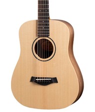
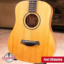
Taylor BT1 Baby Taylor Acoustic Guitar with Gig Bag
Check the listing for details.


| Location | Rapid City US |
| Shipping | Free shipping (check listing for details) |
| Seller |
haggertysmusic
99.1% positive · 582 feedback
|
| Listing | FixedPrice · Active |
| Start time | 2025-12-23T19:13:30.000Z |
| UPC | 0887766105398 |
| Body Color | Beige |
| Neck Material | Maple |
| MPN | BT1 |
| Number of Frets | 19 |
| Brand | Taylor |
| Series | GS Mini Baby |
| Model Year | 2020 |
| Type | Acoustic Travel Guitar |
| Body Material | Spruce, Walnut |
| Performance Level | Professional |
| Fretboard Material | Ebony |
| String Configuration | 6 String |
| Model | BT1 |
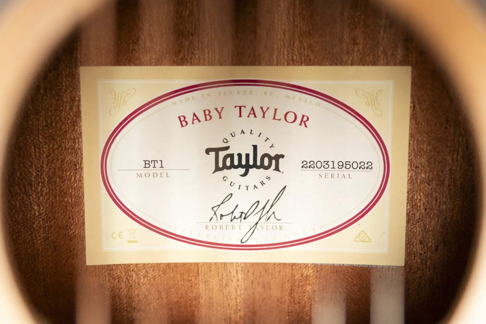
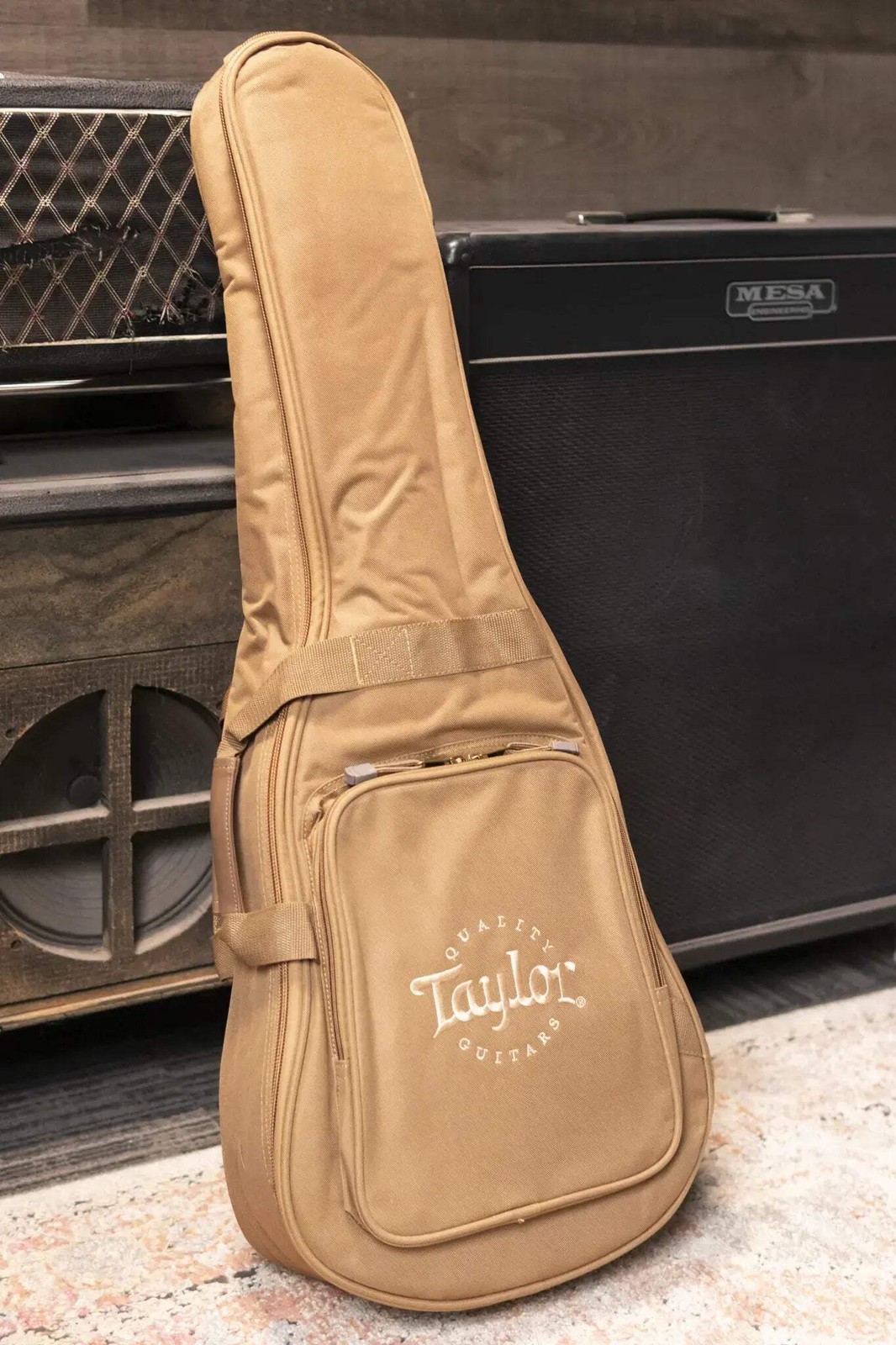
Taylor BT1 Baby Taylor Acoustic Guitar with Gig Bag -YOU ARE VIEWING PHOTOS OF THE ACTUAL GUITAR BEING SOLD! This brand new Taylor will ship insured, fully set up, and inspected from Rapid City, SD. Buy risk free with our 14 day - full refund, less shipping, return policy. Check out our shop policies for more details. Whether you’re a young learner, a songwriter on the move, or a seasoned player in need of a portable guitar, the Taylor BT1 Baby Taylor is designed to inspire wherever you go. As one of the world’s most popular travel-
size guitars, this ¾-scale dreadnought proves that compact
size doesn’t have to mean a compromise in tone. Its solid torrefied spruce top delivers a surprisingly bold, clear voice, with warmth and projection that make it feel bigger than it looks. The layered walnut back and sides provide durability and a pleasing natural aesthetic, while Taylor’s signature neck design ensures comfortable, easy playability for hands of all sizes. With its short 22-3/4" scale length and light, balanced build, the Baby Taylor is perfect for kids starting out, casual players who want an accessible instrument around the house, or guitarists looking for a reliable companion for camping, travel, or off-the-cuff songwriting. Outfitted with die-cast chrome tuners, ebony bridge and fingerboard, and finished in a natural matte treatment that showcases the spruce top, this Baby Taylor is both practical and inviting. It ships with a soft gig bag, making it ready for life on the go. Available now at Haggerty’s Music. Features / Specs Highlights Orientation: Right-Handed Electronics: None Bracing: X-Bracing Cutaway: None Body Body Shape: ¾ Dreadnought (Baby) Top Material: Torrefied Spruce Top Finish: Matte Top Color: Natural Back & Sides Material: Layered Walnut Back Configuration: 2-Piece, No Wedge Back & Sides Finish: Matte Bracing: X-Bracing Binding Material: None Rosette: Single-Ring (Black with White Outlines) Neck Neck Profile: Standard Carve Neck Material: Mahogany Neck Taper: Slim Neck Depth: 0.835" at 1st Fret, 0.856" at 9th Fret Scale Length: 22-3/4" Fingerboard Material: Ebony Fingerboard Inlay: 4mm Dot Italian Acrylic Fingerboard Binding: None Fingerboard Radius: 15" Neck Finish: Matte Neck Joint: Scarf Joint Headstock: Paddle - Baby Headstock Binding: None Headplate Inlay: White Taylor Logo Headplate Finish: Matte Hardware Bridge Style: Standard Acoustic Belly Bridge Material: West African Crelicam Ebony Bridge Pins: Black Plastic Saddle: Micarta Nut Material: Nubone Nut Width: 1-11/16" Tuners: Die-Cast Chrome Pickguard: None Miscellaneous Electronics: None Strings: D'Addario XS Coated Phosphor Bronze Light (.012 - Case/Gig Bag: Taylor Soft Gig Bag Serial Number: 2203195022 Manufacture Date: 2025 elm.clearfix .clearfix:before,.clearfix:after .clearfix:after .hide-text .input-block-level article,aside,details,figcaption,figure,footer,header,hgroup,nav,section audio,canvas,video audio:not([controls]) html a:focus a:hover,a:active sub,sup sup sub img #map_canvas img,.google-maps img button,input,select,textarea button,input button::-moz-focus-inner,input::-moz-focus-inner button,html input[type="button"],input[type="reset"],input[type="submit"] label,select,button,input[type="button"],input[type="reset"],input[type="submit"],input[type="radio"],input[type="checkbox"] input[type="search"] input[type="search"]::-webkit-search-decoration,input[type="search"]::-webkit-search-cancel-button textarea @media print a,a:visited a[href]:after abbr[title]:after .ir a:after,a[href^="js:"]:after,a[href^="#"]:after pre,blockquote thead tr,img img @page p,h2,h3 h2,h3 }body a a:hover,a:focus .img-rounded .img-polaroid .img-circle .row .row:before,.row:after .row:after [class*="span"] .container,.navbar-static-top ,.navbar-fixed-top ,.navbar-fixed-bottom .span12 .span11 .span10 .span9 .span8 .span7 .span6 .span5 .span4 .span3 .span2 .span1 .offset12 .offset11 .offset10 .offset9 .offset8 .offset7 .offset6 .offset5 .offset4 .offset3 .offset2 .offset1 .row-fluid .row-fluid:before,.row-fluid:after .row-fluid:after .row-fluid [class*="span"] .row-fluid [class*="span"]:first-child .row-fluid [class*="span"]+[class*="span"] .row-fluid .row-fluid .row-fluid .row-fluid .row-fluid .row-fluid .row-fluid .row-fluid .row-fluid .row-fluid .row-fluid .row-fluid .row-fluid .row-fluid .row-fluid .row-fluid .row-fluid .row-fluid .row-fluid .row-fluid .row-fluid .row-fluid .row-fluid .row-fluid .row-fluid .row-fluid .row-fluid .row-fluid .row-fluid .row-fluid .row-fluid .row-fluid .row-fluid .row-fluid .row-fluid .row-fluid [class*="span"].hide,.row-fluid [class*="span"].hide [class*="span"].pull-right,.row-fluid [class*="span"].pull-right .container .container:before,.container:after .container:after .container-fluid .container-fluid:before,.container-fluid:after .container-fluid:after p .lead small strong em cite .muted a.muted:hover,a.muted:focus .text-warning a.text-warning:hover,a.text-warning:focus .text-error a.text-error:hover,a.text-error:focus .text-info a.text-info:hover,a.text-info:focus .text-success a.text-success:hover,a.text-success:focus .text-left .text-right .text-center h1,h2,h3,h4,h5,h6 h1 small,h2 small,h3 small,h4 small,h5 small,h6 small h1,h2,h3 h1 h2 h3 h4 h5 h6 h1 small h2 small h3 small h4 small .page-header ul,ol ul ul,ul ol,ol ol,ol ul li ul.unstyled,ol.unstyled ul.inline,ol.inline ul.inline>li,ol.inline>li dl dt,dd dt dd .dl-horizontal .dl-horizontal:before,.dl-horizontal:after .dl-horizontal:after .dl-horizontal dt .dl-horizontal dd hr abbr[title],abbr[data-original-title] abbr.initialism blockquote blockquote p blockquote small blockquote small:before blockquote.pull-right blockquote.pull-right p,blockquote.pull-right small blockquote.pull-right small:before blockquote.pull-right small:after q:before,q:after,blockquote:before,blockquote:after address code,pre code pre pre.prettyprint pre code .pre-scrollable form fieldset legend legend small label,input,button,select,textarea input,button,select,textarea label select,textarea,input[type="text"],input[type="password"],input[type="datetime"],input[type="datetime-local"],input[type="date"],input[type="month"],input[type="time"],input[type="week"],input[type="number"],input[type="email"],input[type="url"],input[type="search"],input[type="tel"],input[type="color"],.uneditable-input input,textarea,.uneditable-input textarea textarea,input[type="text"],input[type="password"],input[type="datetime"],input[type="datetime-local"],input[type="date"],input[type="month"],input[type="time"],input[type="week"],input[type="number"],input[type="email"],input[type="url"],input[type="search"],input[type="tel"],input[type="color"],.uneditable-input textarea:focus,input[type="text"]:focus,input[type="password"]:focus,input[type="datetime"]:focus,input[type="datetime-local"]:focus,input[type="date"]:focus,input[type="month"]:focus,input[type="time"]:focus,input[type="week"]:focus,input[type="number"]:focus,input[type="email"]:focus,input[type="url"]:focus,input[type="search"]:focus,input[type="tel"]:focus,input[type="color"]:focus,.uneditable-input:focus input[type="radio"],input[type="checkbox"] input[type="file"],input[type="image"],input[type="submit"],input[type="reset"],input[type="button"],input[type="radio"],input[type="checkbox"] select,input[type="file"] select select[multiple],select[size] select:focus,input[type="file"]:focus,input[type="radio"]:focus,input[type="checkbox"]:focus .uneditable-input,.uneditable-textarea .uneditable-input .uneditable-textarea input:-moz-placeholder,textarea:-moz-placeholder input:-ms-input-placeholder,textarea:-ms-input-placeholder input::-webkit-input-placeholder,textarea::-webkit-input-placeholder .radio,.checkbox .radio input[type="radio"],.checkbox input[type="checkbox"] .controls>.radio:first-child,.controls>.checkbox:first-child .radio.inline,.checkbox.inline .radio.inline+.radio.inline,.checkbox.inline+.checkbox.inline .input-mini .input-small .input-medium .input-large .input-xlarge .input-xxlarge input[class*="span"],select[class*="span"],textarea[class*="span"],.uneditable-input[class*="span"],.row-fluid input[class*="span"],.row-fluid select[class*="span"],.row-fluid textarea[class*="span"],.row-fluid [class*="span"] .input-append input[class*="span"],.input-append [class*="span"],.input-prepend input[class*="span"],.input-prepend [class*="span"],.row-fluid input[class*="span"],.row-fluid select[class*="span"],.row-fluid textarea[class*="span"],.row-fluid [class*="span"],.row-fluid [class*="span"],.row-fluid [class*="span"] input,textarea,.uneditable-input .controls-row [class*="span"]+[class*="span"] input.span12,textarea.span12,.uneditable-input.span12 input.span11,textarea.span11,.uneditable-input.span11 input.span10,textarea.span10,.uneditable-input.span10 input.span9,textarea.span9,.uneditable-input.span9 input.span8,textarea.span8,.uneditable-input.span8 input.span7,textarea.span7,.uneditable-input.span7 input.span6,textarea.span6,.uneditable-input.span6 input.span5,textarea.span5,.uneditable-input.span5 input.span4,textarea.span4,.uneditable-input.span4 input.span3,textarea.span3,.uneditable-input.span3 input.span2,textarea.span2,.uneditable-input.span2 input.span1,textarea.span1,.uneditable-input.span1 .controls-row .controls-row:before,.controls-row:after .controls-row:after .controls-row [class*="span"],.row-fluid [class*="span"] .controls-row [class*="span"],.controls-row [class*="span"] input[disabled],select[disabled],textarea[disabled],input[readonly],select[readonly],textarea[readonly] input[type="radio"][disabled],input[type="checkbox"][disabled],input[type="radio"][readonly],input[type="checkbox"][readonly] .control-group.warning ,.control-group.warning ,.control-group.warning .control-group.warning ,.control-group.warning ,.control-group.warning input,.control-group.warning select,.control-group.warning textarea .control-group.warning input,.control-group.warning select,.control-group.warning textarea .control-group.warning input:focus,.control-group.warning select:focus,.control-group.warning textarea:focus .control-group.warning ,.control-group.warning .control-group.error ,.control-group.error ,.control-group.error .control-group.error ,.control-group.error ,.control-group.error input,.control-group.error select,.control-group.error textarea .control-group.error input,.control-group.error select,.control-group.error textarea .control-group.error input:focus,.control-group.error select:focus,.control-group.error textarea:focus .control-group.error ,.control-group.error .control-group.success ,.control-group.success ,.control-group.success .control-group.success ,.control-group.success ,.control-group.success input,.control-group.success select,.control-group.success textarea .control-group.success input,.control-group.success select,.control-group.success textarea .control-group.success input:focus,.control-group.success select:focus,.control-group.success textarea:focus .control-group.success ,.control-group.success .control-group.info ,.control-group.info ,.control-group.info .control-group.info ,.control-group.info ,.control-group.info input,.control-group.info select,.control-group.info textarea .control-group.info input,.control-group.info select,.control-group.info textarea .control-group.info input:focus,.control-group.info select:focus,.control-group.info textarea:focus .control-group.info ,.control-group.info input:focus:invalid,textarea:focus:invalid,select:focus:invalid input:focus:invalid:focus,textarea:focus:invalid:focus,select:focus:invalid:focus .form-actions .form-actions:before,.form-actions:after .form-actions:after .help-block,.help-inline .help-block .help-inline .input-append,.input-prepend .input-append input,.input-prepend input,.input-append select,.input-prepend select,.input-append ,.input-prepend ,.input-append ,.input-prepend ,.input-append ,.input-prepend .input-append input,.input-prepend input,.input-append select,.input-prepend select,.input-append ,.input-prepend .input-append input:focus,.input-prepend input:focus,.input-append select:focus,.input-prepend select:focus,.input-append ,.input-prepend .input-append ,.input-prepend .input-append ,.input-prepend ,.input-append ,.input-prepend ,.input-append >.dropdown-toggle,.input-prepend >.dropdown-toggle .input-append ,.input-prepend .input-prepend ,.input-prepend .input-prepend ,.input-prepend .input-append input,.input-append select,.input-append .input-append input+.btn-group ,.input-append select+.btn-group ,.input-append +.btn-group .input-append ,.input-append ,.input-append .input-append ,.input-append ,.input-append >.dropdown-toggle .input-prepend.input-append input,.input-prepend.input-append select,.input-prepend.input-append .input-prepend.input-append input+.btn-group ,.input-prepend.input-append select+.btn-group ,.input-prepend.input-append +.btn-group .input-prepend.input-append ,.input-prepend.input-append .input-prepend.input-append ,.input-prepend.input-append .input-prepend.input-append input.search-query .form-search ,.form-search .form-search .form-search .form-search .form-search .form-search input,.form-inline input,.form-horizontal input,.form-search textarea,.form-inline textarea,.form-horizontal textarea,.form-search select,.form-inline select,.form-horizontal select,.form-search ,.form-inline ,.form-horizontal ,.form-search ,.form-inline ,.form-horizontal ,.form-search ,.form-inline ,.form-horizontal ,.form-search ,.form-inline ,.form-horizontal .form-search ,.form-inline ,.form-horizontal .form-search label,.form-inline label,.form-search ,.form-inline .form-search ,.form-inline ,.form-search ,.form-inline .form-search ,.form-search ,.form-inline ,.form-inline .form-search input[type="radio"],.form-search input[type="checkbox"],.form-inline input[type="radio"],.form-inline input[type="checkbox"] .control-group legend+.control-group .form-horizontal .form-horizontal ,.form-horizontal .form-horizontal .form-horizontal .form-horizontal .form-horizontal .form-horizontal .form-horizontal input+.help-block,.form-horizontal select+.help-block,.form-horizontal textarea+.help-block,.form-horizontal +.help-block,.form-horizontal +.help-block,.form-horizontal +.help-block .form-horizontal table .table .table th,.table td .table th .table thead th .table caption+thead tr:first-child th,.table caption+thead tr:first-child td,.table colgroup+thead tr:first-child th,.table colgroup+thead tr:first-child td,.table thead:first-child tr:first-child th,.table thead:first-child tr:first-child td .table tbody+tbody .table .table-condensed th,.table-condensed td .table-bordered .table-bordered th,.table-bordered td .table-bordered caption+thead tr:first-child th,.table-bordered caption+tbody tr:first-child th,.table-bordered caption+tbody tr:first-child td,.table-bordered colgroup+thead tr:first-child th,.table-bordered colgroup+tbody tr:first-child th,.table-bordered colgroup+tbody tr:first-child td,.table-bordered thead:first-child tr:first-child th,.table-bordered tbody:first-child tr:first-child th,.table-bordered tbody:first-child tr:first-child td .table-bordered thead:first-child tr:first-child>th:first-child,.table-bordered tbody:first-child tr:first-child>td:first-child,.table-bordered tbody:first-child tr:first-child>th:first-child .table-bordered thead:first-child tr:first-child>th:last-child,.table-bordered tbody:first-child tr:first-child>td:last-child,.table-bordered tbody:first-child tr:first-child>th:last-child .table-bordered thead:last-child tr:last-child>th:first-child,.table-bordered tbody:last-child tr:last-child>td:first-child,.table-bordered tbody:last-child tr:last-child>th:first-child,.table-bordered tfoot:last-child tr:last-child>td:first-child,.table-bordered tfoot:last-child tr:last-child>th:first-child .table-bordered thead:last-child tr:last-child>th:last-child,.table-bordered tbody:last-child tr:last-child>td:last-child,.table-bordered tbody:last-child tr:last-child>th:last-child,.table-bordered tfoot:last-child tr:last-child>td:last-child,.table-bordered tfoot:last-child tr:last-child>th:last-child .table-bordered tfoot+tbody:last-child tr:last-child td:first-child .table-bordered tfoot+tbody:last-child tr:last-child td:last-child .table-bordered caption+thead tr:first-child th:first-child,.table-bordered caption+tbody tr:first-child td:first-child,.table-bordered colgroup+thead tr:first-child th:first-child,.table-bordered colgroup+tbody tr:first-child td:first-child .table-bordered caption+thead tr:first-child th:last-child,.table-bordered caption+tbody tr:first-child td:last-child,.table-bordered colgroup+thead tr:first-child th:last-child,.table-bordered colgroup+tbody tr:first-child td:last-child .table-striped tbody>tr:nth-child(odd)>td,.table-striped tbody>tr:nth-child(odd)>th .table-hover tbody tr:hover>td,.table-hover tbody tr:hover>th table td[class*="span"],table th[class*="span"],.row-fluid table td[class*="span"],.row-fluid table th[class*="span"] .table td.span1,.table th.span1 .table td.span2,.table th.span2 .table td.span3,.table th.span3 .table td.span4,.table th.span4 .table td.span5,.table th.span5 .table td.span6,.table th.span6 .table td.span7,.table th.span7 .table td.span8,.table th.span8 .table td.span9,.table th.span9 .table td.span10,.table th.span10 .table td.span11,.table th.span11 .table td.span12,.table th.span12 .table tbody tr.success>td .table tbody tr.error>td .table tbody tr.warning>td .table tbody tr.info>td .table-hover tbody tr.success:hover>td .table-hover tbody tr.error:hover>td .table-hover tbody tr.warning:hover>td .table-hover tbody tr.info:hover>td [class^="icon-"],[class*=" icon-"] .icon-white,.nav-pills>.active>a>[class^="icon-"],.nav-pills>.active>a>[class*=" icon-"],.nav-list>.active>a>[class^="icon-"],.nav-list>.active>a>[class*=" icon-"],.navbar-inverse >.active>a>[class^="icon-"],.navbar-inverse >.active>a>[class*=" icon-"],.dropdown-menu>li>a:hover>[class^="icon-"],.dropdown-menu>li>a:focus>[class^="icon-"],.dropdown-menu>li>a:hover>[class*=" icon-"],.dropdown-menu>li>a:focus>[class*=" icon-"],.dropdown-menu>.active>a>[class^="icon-"],.dropdown-menu>.active>a>[class*=" icon-"],.dropdown-submenu:hover>a>[class^="icon-"],.dropdown-submenu:focus>a>[class^="icon-"],.dropdown-submenu:hover>a>[class*=" icon-"],.dropdown-submenu:focus>a>[class*=" icon-"] .icon-glass .icon-music .icon-search .icon-envelope .icon-heart .icon-star .icon-star-empty .icon-user .icon-film .icon-th-large .icon-th .icon-th-list .icon-ok .icon-remove .icon-zoom-in .icon-zoom-out .icon-off .icon-signal .icon-cog .icon-trash .icon-home .icon-file .icon-time .icon-road .icon-download-alt .icon-download .icon-upload .icon-inbox .icon-play-circle .icon-repeat .icon-refresh .icon-list-alt .icon-lock .icon-flag .icon-headphones .icon-volume-off .icon-volume-down .icon-volume-up .icon-qrcode .icon-barcode .icon-tag .icon-tags .icon-book .icon-bookmark .icon-print .icon-camera .icon-font .icon-bold .icon-italic .icon-text-height .icon-text-width .icon-align-left .icon-align-center .icon-align-right .icon-align-justify .icon-list .icon-indent-left .icon-indent-right .icon-facetime-video .icon-picture .icon-pencil .icon-map-marker .icon-adjust .icon-tint .icon-edit .icon-share .icon-check .icon-move .icon-step-backward .icon-fast-backward .icon-backward .icon-play .icon-pause .icon-stop .icon-forward .icon-fast-forward .icon-step-forward .icon-eject .icon-chevron-left .icon-chevron-right .icon-plus-sign .icon-minus-sign .icon-remove-sign .icon-ok-sign .icon-question-sign .icon-info-sign .icon-screenshot .icon-remove-circle .icon-ok-circle .icon-ban-circle .icon-arrow-left .icon-arrow-right .icon-arrow-up .icon-arrow-down .icon-share-alt .icon-resize-full .icon-resize-small .icon-plus .icon-minus .icon-asterisk .icon-exclamation-sign .icon-gift .icon-leaf .icon-fire .icon-eye-open .icon-eye-close .icon-warning-sign .icon-plane .icon-calendar .icon-random .icon-comment .icon-magnet .icon-chevron-up .icon-chevron-down .icon-retweet .icon-shopping-cart .icon-folder-close .icon-folder-open .icon-resize-vertical .icon-resize-horizontal .icon-hdd .icon-bullhorn .icon-bell .icon-certificate .icon-thumbs-up .icon-thumbs-down .icon-hand-right .icon-hand-left .icon-hand-up .icon-hand-down .icon-circle-arrow-right .icon-circle-arrow-left .icon-circle-arrow-up .icon-circle-arrow-down .icon-globe .icon-wrench .icon-tasks .icon-filter .icon-briefcase .icon-fullscreen .dropup,.dropdown .dropdown-toggle .dropdown-toggle:active,.open .caret .dropdown .dropdown-menu .dropdown-menu.pull-right .dropdown-menu .dropdown-menu>li>a .dropdown-menu>li>a:hover,.dropdown-menu>li>a:focus,.dropdown-submenu:hover>a,.dropdown-submenu:focus>a .dropdown-menu>.active>a,.dropdown-menu>.active>a:hover,.dropdown-menu>.active>a:focus .dropdown-menu>.disabled>a,.dropdown-menu>.disabled>a:hover,.dropdown-menu>.disabled>a:focus .dropdown-menu>.disabled>a:hover,.dropdown-menu>.disabled>a:focus .open .open>.dropdown-menu .dropdown-backdrop .pull-right>.dropdown-menu .dropup ,.navbar-fixed-bottom .dropup ,.navbar-fixed-bottom .dropdown-submenu .dropdown-submenu>.dropdown-menu .dropdown-submenu:hover>.dropdown-menu .dropup >.dropdown-menu .dropdown-submenu>a:after .dropdown-submenu:hover>a:after .dropdown-submenu.pull-left .dropdown-submenu.pull-left>.dropdown-menu .dropdown .typeahead .well .well blockquote .well-large .well-small .fade .fade.in .collapse .collapse.in .close .close:hover,.close:focus button.close .btn .btn:hover,.btn:focus,.btn:active,.btn.active,.btn.disabled,.btn[disabled] .btn:active,.btn.active .btn:first-child .btn:hover,.btn:focus .btn:focus .btn.active,.btn:active .btn.disabled,.btn[disabled] .btn-large .btn-large [class^="icon-"],.btn-large [class*=" icon-"] .btn-small .btn-small [class^="icon-"],.btn-small [class*=" icon-"] .btn-mini [class^="icon-"],.btn-mini [class*=" icon-"] .btn-mini .btn-block .btn-block+.btn-block input[type="submit"].btn-block,input[type="reset"].btn-block,input[type="button"].btn-block .btn-primary.active,.btn-warning.active,.btn-danger.active,.btn-success.active,.btn-info.active,.btn-inverse.active .btn-primary .btn-primary:hover,.btn-primary:focus,.btn-primary:active,.btn-primary.active,.btn-primary.disabled,.btn-primary[disabled] .btn-primary:active,.btn-primary.active .btn-warning .btn-warning:hover,.btn-warning:focus,.btn-warning:active,.btn-warning.active,.btn-warning.disabled,.btn-warning[disabled] .btn-warning:active,.btn-warning.active .btn-danger .btn-danger:hover,.btn-danger:focus,.btn-danger:active,.btn-danger.active,.btn-danger.disabled,.btn-danger[disabled] .btn-danger:active,.btn-danger.active .btn-success .btn-success:hover,.btn-success:focus,.btn-success:active,.btn-success.active,.btn-success.disabled,.btn-success[disabled] .btn-success:active,.btn-success.active .btn-info .btn-info:hover,.btn-info:focus,.btn-info:active,.btn-info.active,.btn-info.disabled,.btn-info[disabled] .btn-info:active,.btn-info.active .btn-inverse .btn-inverse:hover,.btn-inverse:focus,.btn-inverse:active,.btn-inverse.active,.btn-inverse.disabled,.btn-inverse[disabled] .btn-inverse:active,.btn-inverse.active button.btn,input[type="submit"].btn button.btn::-moz-focus-inner,input[type="submit"].btn::-moz-focus-inner button.btn.btn-large,input[type="submit"].btn.btn-large button.btn.btn-small,input[type="submit"].btn.btn-small button.btn.btn-mini,input[type="submit"].btn.btn-mini .btn-link,.btn-link:active,.btn-link[disabled] .btn-link .btn-link:hover,.btn-link:focus .btn-link[disabled]:hover,.btn-link[disabled]:focus .btn-group .btn-group:first-child .btn-group+.btn-group .btn-toolbar .btn-toolbar>.btn+.btn,.btn-toolbar>.btn-group+.btn,.btn-toolbar>.btn+.btn-group .btn-group>.btn .btn-group>.btn+.btn .btn-group>.btn,.btn-group>.dropdown-menu,.btn-group>.popover .btn-group>.btn-mini .btn-group>.btn-small .btn-group>.btn-large .btn-group>.btn:first-child .btn-group>.btn:last-child,.btn-group>.dropdown-toggle .btn-group>.btn.large:first-child .btn-group>.btn.large:last-child,.btn-group>.large.dropdown-toggle .btn-group>.btn:hover,.btn-group>.btn:focus,.btn-group>.btn:active,.btn-group>.btn.active .btn-group ,.btn-group.open .btn-group>.btn+.dropdown-toggle .btn-group>.btn-mini+.dropdown-toggle .btn-group>.btn-small+.dropdown-toggle .btn-group>.btn-large+.dropdown-toggle .btn-group.open .btn-group.open .dropdown-toggle .btn-group.open .dropdown-toggle .btn-group.open .dropdown-toggle .btn-group.open .dropdown-toggle .btn-group.open .dropdown-toggle .btn-group.open .dropdown-toggle .btn-group.open .dropdown-toggle .btn .btn-large .btn-large .btn-mini ,.btn-small .dropup .btn-primary ,.btn-warning ,.btn-danger ,.btn-info ,.btn-success ,.btn-inverse .btn-group-vertical .btn-group-vertical>.btn .btn-group-vertical>.btn+.btn .btn-group-vertical>.btn:first-child .btn-group-vertical>.btn:last-child .btn-group-vertical>.btn-large:first-child .btn-group-vertical>.btn-large:last-child .alert .alert,.alert h4 .alert h4 .alert .alert-success .alert-success h4 .alert-danger,.alert-error .alert-danger h4,.alert-error h4 .alert-info .alert-info h4 .alert-block .alert-block>p,.alert-block>ul .alert-block p+p .nav .nav>li>a .nav>li>a:hover,.nav>li>a:focus .nav>li>a>img .nav>.pull-right .nav-header .nav li+.nav-header .nav-list .nav-list>li>a,.nav-list .nav-list>li>a .nav-list>.active>a,.nav-list>.active>a:hover,.nav-list>.active>a:focus .nav-list [class^="icon-"],.nav-list [class*=" icon-"] .nav-list .nav-tabs,.nav-pills .nav-tabs:before,.nav-pills:before,.nav-tabs:after,.nav-pills:after .nav-tabs:after,.nav-pills:after .nav-tabs>li,.nav-pills>li .nav-tabs>li>a,.nav-pills>li>a .nav-tabs .nav-tabs>li .nav-tabs>li>a .nav-tabs>li>a:hover,.nav-tabs>li>a:focus .nav-tabs>.active>a,.nav-tabs>.active>a:hover,.nav-tabs>.active>a:focus .nav-pills>li>a .nav-pills>.active>a,.nav-pills>.active>a:hover,.nav-pills>.active>a:focus .nav-stacked>li .nav-stacked>li>a .nav-tabs.nav-stacked .nav-tabs.nav-stacked>li>a .nav-tabs.nav-stacked>li:first-child>a .nav-tabs.nav-stacked>li:last-child>a .nav-tabs.nav-stacked>li>a:hover,.nav-tabs.nav-stacked>li>a:focus .nav-pills.nav-stacked>li>a .nav-pills.nav-stacked>li:last-child>a .nav-tabs .nav-pills .nav .nav ,.nav .nav-tabs .nav .nav-tabs .nav>.dropdown.active>a:hover,.nav>.dropdown.active>a:focus .nav-tabs ,.nav-pills ,.nav>li.dropdown.open.active>a:hover,.nav>li.dropdown.open.active>a:focus .nav li.dropdown.open ,.nav li.dropdown.open.active ,.nav li.dropdown.open a:hover ,.nav li.dropdown.open a:focus .tabs-stacked >a:hover,.tabs-stacked >a:focus .tabbable .tabbable:before,.tabbable:after .tabbable:after .tab-content .tabs-below>.nav-tabs,.tabs-right>.nav-tabs,.tabs-left>.nav-tabs .tab-content>.tab-pane,.pill-content>.pill-pane .tab-content>.active,.pill-content>.active .tabs-below>.nav-tabs .tabs-below>.nav-tabs>li .tabs-below>.nav-tabs>li>a .tabs-below>.nav-tabs>li>a:hover,.tabs-below>.nav-tabs>li>a:focus .tabs-below>.nav-tabs>.active>a,.tabs-below>.nav-tabs>.active>a:hover,.tabs-below>.nav-tabs>.active>a:focus .tabs-left>.nav-tabs>li,.tabs-right>.nav-tabs>li .tabs-left>.nav-tabs>li>a,.tabs-right>.nav-tabs>li>a .tabs-left>.nav-tabs .tabs-left>.nav-tabs>li>a .tabs-left>.nav-tabs>li>a:hover,.tabs-left>.nav-tabs>li>a:focus .tabs-left>.nav-tabs >a,.tabs-left>.nav-tabs >a:hover,.tabs-left>.nav-tabs >a:focus .tabs-right>.nav-tabs .tabs-right>.nav-tabs>li>a .tabs-right>.nav-tabs>li>a:hover,.tabs-right>.nav-tabs>li>a:focus .tabs-right>.nav-tabs >a,.tabs-right>.nav-tabs >a:hover,.tabs-right>.nav-tabs >a:focus .nav>.disabled>a .nav>.disabled>a:hover,.nav>.disabled>a:focus .navbar .navbar-inner .navbar-inner:before,.navbar-inner:after .navbar-inner:after .navbar .nav-collapse.collapse .navbar .navbar ,.navbar .navbar-text .navbar-link .navbar-link:hover,.navbar-link:focus .navbar .navbar ,.navbar .navbar ,.navbar ,.navbar ,.navbar ,.navbar .navbar-form .navbar-form:before,.navbar-form:after .navbar-form:after .navbar-form input,.navbar-form select,.navbar-form ,.navbar-form .navbar-form input,.navbar-form select,.navbar-form .navbar-form input[type="image"],.navbar-form input[type="checkbox"],.navbar-form input[type="radio"] .navbar-form ,.navbar-form .navbar-form input,.navbar-form input .navbar-search .navbar-search .navbar-static-top .navbar-static-top .navbar-fixed-top,.navbar-fixed-bottom .navbar-fixed-top ,.navbar-static-top .navbar-fixed-bottom .navbar-fixed-top ,.navbar-fixed-bottom .navbar-static-top ,.navbar-fixed-top ,.navbar-fixed-bottom .navbar-fixed-top .navbar-fixed-top ,.navbar-static-top .navbar-fixed-bottom .navbar-fixed-bottom .navbar .navbar .pull-right .navbar >li .navbar >li>a .navbar .navbar >li>a:focus,.navbar >li>a:hover .navbar >.active>a,.navbar >.active>a:hover,.navbar >.active>a:focus .navbar .navbar ,.navbar ,.navbar ,.navbar .active,.navbar .disabled,.navbar [disabled] .navbar ,.navbar .active .navbar .btn-navbar +.icon-bar .navbar >li>.dropdown-menu:before .navbar >li>.dropdown-menu:after .navbar-fixed-bottom >li>.dropdown-menu:before .navbar-fixed-bottom >li>.dropdown-menu:after .navbar li.dropdown>a:hover ,.navbar li.dropdown>a:focus .navbar li.dropdown.open>.dropdown-toggle,.navbar li.dropdown.active>.dropdown-toggle,.navbar li.dropdown.open.active>.dropdown-toggle .navbar li.dropdown>.dropdown-toggle .navbar li.dropdown.open>.dropdown-toggle ,.navbar li.dropdown.active>.dropdown-toggle ,.navbar li.dropdown.open.active>.dropdown-toggle .navbar >li>.dropdown-menu,.navbar >li>.dropdown-menu.pull-right .navbar >li>.dropdown-menu:before,.navbar >li>.dropdown-menu.pull-right:before .navbar >li>.dropdown-menu:after,.navbar >li>.dropdown-menu.pull-right:after .navbar >li>.dropdown-menu ,.navbar >li>.dropdown-menu.pull-right .navbar-inverse .navbar-inverse ,.navbar-inverse >li>a .navbar-inverse ,.navbar-inverse >li>a:hover,.navbar-inverse ,.navbar-inverse >li>a:focus .navbar-inverse .navbar-inverse .navbar-inverse >li>a:focus,.navbar-inverse >li>a:hover .navbar-inverse >a,.navbar-inverse >a:hover,.navbar-inverse >a:focus .navbar-inverse .navbar-inverse ,.navbar-inverse .navbar-inverse .navbar-inverse li.dropdown.open>.dropdown-toggle,.navbar-inverse li.dropdown.active>.dropdown-toggle,.navbar-inverse li.dropdown.open.active>.dropdown-toggle .navbar-inverse li.dropdown>a:hover ,.navbar-inverse li.dropdown>a:focus .navbar-inverse li.dropdown>.dropdown-toggle .navbar-inverse li.dropdown.open>.dropdown-toggle ,.navbar-inverse li.dropdown.active>.dropdown-toggle ,.navbar-inverse li.dropdown.open.active>.dropdown-toggle .navbar-inverse .navbar-inverse .navbar-inverse .navbar-inverse .navbar-inverse ,.navbar-inverse .focused .navbar-inverse .navbar-inverse ,.navbar-inverse ,.navbar-inverse ,.navbar-inverse .active,.navbar-inverse .disabled,.navbar-inverse [disabled] .navbar-inverse ,.navbar-inverse .active .breadcrumb .breadcrumb>li .breadcrumb>li>.divider .breadcrumb>.active .pagination .pagination ul .pagination ul>li .pagination ul>li>a,.pagination ul>li>span .pagination ul>li>a:hover,.pagination ul>li>a:focus,.pagination ul>.active>a,.pagination ul>.active>span .pagination ul>.active>a,.pagination ul>.active>span .pagination ul>.disabled>span,.pagination ul>.disabled>a,.pagination ul>.disabled>a:hover,.pagination ul>.disabled>a:focus .pagination ul>li:first-child>a,.pagination ul>li:first-child>span .pagination ul>li:last-child>a,.pagination ul>li:last-child>span .pagination-centered .pagination-right .pagination-large ul>li>a,.pagination-large ul>li>span .pagination-large ul>li:first-child>a,.pagination-large ul>li:first-child>span .pagination-large ul>li:last-child>a,.pagination-large ul>li:last-child>span .pagination-mini ul>li:first-child>a,.pagination-small ul>li:first-child>a,.pagination-mini ul>li:first-child>span,.pagination-small ul>li:first-child>span .pagination-mini ul>li:last-child>a,.pagination-small ul>li:last-child>a,.pagination-mini ul>li:last-child>span,.pagination-small ul>li:last-child>span .pagination-small ul>li>a,.pagination-small ul>li>span .pagination-mini ul>li>a,.pagination-mini ul>li>span .pager .pager:before,.pager:after .pager:after .pager li .pager li>a,.pager li>span .pager li>a:hover,.pager li>a:focus .pager >a,.pager >span .pager >a,.pager >span .pager >a,.pager >a:hover,.pager >a:focus,.pager >span .modal-backdrop .modal-backdrop.fade .modal-backdrop,.modal-backdrop.fade.in .modal .modal.fade .modal.fade.in .modal-header .modal-header .modal-header h3 .modal-body .modal-form .modal-footer .modal-footer:before,.modal-footer:after .modal-footer:after .modal-footer +.btn .modal-footer +.btn .modal-footer +.btn-block .tooltip .tooltip.in .tooltip.top .tooltip.right .tooltip.bottom .tooltip.left .tooltip-inner .tooltip-arrow .tooltip.top .tooltip.right .tooltip.left .tooltip.bottom .popover .popover.top .popover.right .popover.bottom .popover.left .popover-title .popover-title:empty .popover-content .popover ,.popover .popover .popover .popover.top .popover.top .popover.right .popover.right .popover.bottom .popover.bottom .popover.left .popover.left .thumbnails .thumbnails:before,.thumbnails:after .thumbnails:after .row-fluid .thumbnails>li .thumbnail a.thumbnail:hover,a.thumbnail:focus .thumbnail>img .thumbnail .media,.media-body .media,.media .media:first-child .media-object .media-heading .media>.pull-left .media>.pull-right .media-list .label,.badge .label .badge .label:empty,.badge:empty a.label:hover,a.label:focus,a.badge:hover,a.badge:focus .label-important,.badge-important .label-important[href],.badge-important[href] .label-warning,.badge-warning .label-warning[href],.badge-warning[href] .label-success,.badge-success .label-success[href],.badge-success[href] .label-info,.badge-info .label-info[href],.badge-info[href] .label-inverse,.badge-inverse .label-inverse[href],.badge-inverse[href] .btn ,.btn .btn-mini ,.btn-mini @-webkit-keyframes progress-bar-stripes to }@-moz-keyframes progress-bar-stripes to }@-ms-keyframes progress-bar-stripes to }@-o-keyframes progress-bar-stripes to }@keyframes progress-bar-stripes to }.progress .progress .progress +.bar .progress-striped .progress.active .progress-danger ,.progress .progress-danger.progress-striped ,.progress-striped .progress-success ,.progress .progress-success.progress-striped ,.progress-striped .progress-info ,.progress .progress-info.progress-striped ,.progress-striped .progress-warning ,.progress .progress-warning.progress-striped ,.progress-striped .accordion .accordion-group .accordion-heading .accordion-heading .accordion-toggle .accordion-inner .carousel .carousel-inner .carousel-inner>.item .carousel-inner>.item>img,.carousel-inner>.item>a>img .carousel-inner>.active,.carousel-inner>.next,.carousel-inner>.prev .carousel-inner>.active .carousel-inner>.next,.carousel-inner>.prev .carousel-inner>.next .carousel-inner>.prev .carousel-inner>.next.left,.carousel-inner>.prev.right .carousel-inner>.active.left .carousel-inner>.active.right .carousel-control .carousel-control.right .carousel-control:hover,.carousel-control:focus .carousel-indicators .carousel-indicators li .carousel-indicators .carousel-caption .carousel-caption h4,.carousel-caption p .carousel-caption h4 .carousel-caption p .hero-unit .hero-unit h1 .hero-unit li .pull-right .pull-left .hide .show .invisible .affix .clearfix:before,.clearfix:after .clearfix:after .hide-text .input-block-level @-ms-viewport .hidden .visible-phone .visible-tablet .hidden-desktop .visible-desktop @media(min-width:768px) and (max-width:979px) .visible-desktop .visible-tablet .hidden-tablet }@media(max-width:767px) .visible-desktop .visible-phone .hidden-phone }.visible-print @media print .hidden-print }@media(min-width:1200px) .row:before,.row:after .row:after [class*="span"] .container,.navbar-static-top ,.navbar-fixed-top ,.navbar-fixed-bottom .span12 .span11 .span10 .span9 .span8 .span7 .span6 .span5 .span4 .span3 .span2 .span1 .offset12 .offset11 .offset10 .offset9 .offset8 .offset7 .offset6 .offset5 .offset4 .offset3 .offset2 .offset1 .row-fluid .row-fluid:before,.row-fluid:after .row-fluid:after .row-fluid [class*="span"] .row-fluid [class*="span"]:first-child .row-fluid [class*="span"]+[class*="span"] .row-fluid .row-fluid .row-fluid .row-fluid .row-fluid .row-fluid .row-fluid .row-fluid .row-fluid .row-fluid .row-fluid .row-fluid .row-fluid .row-fluid .row-fluid .row-fluid .row-fluid .row-fluid .row-fluid .row-fluid .row-fluid .row-fluid .row-fluid .row-fluid .row-fluid .row-fluid .row-fluid .row-fluid .row-fluid .row-fluid .row-fluid .row-fluid .row-fluid .row-fluid .row-fluid .row-fluid input,textarea,.uneditable-input .controls-row [class*="span"]+[class*="span"] input.span12,textarea.span12,.uneditable-input.span12 input.span11,textarea.span11,.uneditable-input.span11 input.span10,textarea.span10,.uneditable-input.span10 input.span9,textarea.span9,.uneditable-input.span9 input.span8,textarea.span8,.uneditable-input.span8 input.span7,textarea.span7,.uneditable-input.span7 input.span6,textarea.span6,.uneditable-input.span6 input.span5,textarea.span5,.uneditable-input.span5 input.span4,textarea.span4,.uneditable-input.span4 input.span3,textarea.span3,.uneditable-input.span3 input.span2,textarea.span2,.uneditable-input.span2 input.span1,textarea.span1,.uneditable-input.span1 .thumbnails .thumbnails>li .row-fluid }@media(min-width:768px) and (max-width:979px) .row:before,.row:after .row:after [class*="span"] .container,.navbar-static-top ,.navbar-fixed-top ,.navbar-fixed-bottom .span12 .span11 .span10 .span9 .span8 .span7 .span6 .span5 .span4 .span3 .span2 .span1 .offset12 .offset11 .offset10 .offset9 .offset8 .offset7 .offset6 .offset5 .offset4 .offset3 .offset2 .offset1 .row-fluid .row-fluid:before,.row-fluid:after .row-fluid:after .row-fluid [class*="span"] .row-fluid [class*="span"]:first-child .row-fluid [class*="span"]+[class*="span"] .row-fluid .row-fluid .row-fluid .row-fluid .row-fluid .row-fluid .row-fluid .row-fluid .row-fluid .row-fluid .row-fluid .row-fluid .row-fluid .row-fluid .row-fluid .row-fluid .row-fluid .row-fluid .row-fluid .row-fluid .row-fluid .row-fluid .row-fluid .row-fluid .row-fluid .row-fluid .row-fluid .row-fluid .row-fluid .row-fluid .row-fluid .row-fluid .row-fluid .row-fluid .row-fluid .row-fluid input,textarea,.uneditable-input .controls-row [class*="span"]+[class*="span"] input.span12,textarea.span12,.uneditable-input.span12 input.span11,textarea.span11,.uneditable-input.span11 input.span10,textarea.span10,.uneditable-input.span10 input.span9,textarea.span9,.uneditable-input.span9 input.span8,textarea.span8,.uneditable-input.span8 input.span7,textarea.span7,.uneditable-input.span7 input.span6,textarea.span6,.uneditable-input.span6 input.span5,textarea.span5,.uneditable-input.span5 input.span4,textarea.span4,.uneditable-input.span4 input.span3,textarea.span3,.uneditable-input.span3 input.span2,textarea.span2,.uneditable-input.span2 input.span1,textarea.span1,.uneditable-input.span1 }@media(max-width:767px) .navbar-fixed-top,.navbar-fixed-bottom,.navbar-static-top .container-fluid .dl-horizontal dt .dl-horizontal dd .container .row-fluid .row,.thumbnails .thumbnails>li [class*="span"],.uneditable-input[class*="span"],.row-fluid [class*="span"] .span12,.row-fluid .row-fluid [class*="offset"]:first-child .input-large,.input-xlarge,.input-xxlarge,input[class*="span"],select[class*="span"],textarea[class*="span"],.uneditable-input .input-prepend input,.input-append input,.input-prepend input[class*="span"],.input-append input[class*="span"] .controls-row [class*="span"]+[class*="span"] .modal .modal.fade .modal.fade.in }@media(max-width:480px) .page-header h1 small input[type="checkbox"],input[type="radio"] .form-horizontal .form-horizontal .form-horizontal .form-horizontal .media ,.media .media-object .modal .modal-header .carousel-caption }@media(max-width:979px) .navbar-fixed-top,.navbar-fixed-bottom .navbar-fixed-top .navbar-fixed-bottom .navbar-fixed-top ,.navbar-fixed-bottom .navbar .navbar .nav-collapse .nav-collapse .nav-collapse >li .nav-collapse >li>a .nav-collapse >.divider-vertical .nav-collapse .nav-collapse >li>a,.nav-collapse a .nav-collapse .nav-collapse li+li a .nav-collapse >li>a:hover,.nav-collapse >li>a:focus,.nav-collapse a:hover,.nav-collapse a:focus .navbar-inverse >li>a,.navbar-inverse a .navbar-inverse >li>a:hover,.navbar-inverse >li>a:focus,.navbar-inverse a:hover,.navbar-inverse a:focus .nav-collapse.in .nav-collapse .nav-collapse >.dropdown-menu .nav-collapse ,.nav-collapse .nav-collapse .nav-collapse >li>.dropdown-menu:before,.nav-collapse >li>.dropdown-menu:after .nav-collapse ,.nav-collapse .navbar-inverse ,.navbar-inverse .navbar .pull-right .nav-collapse,.nav-collapse.collapse .navbar .navbar-static }@media(min-width:980px) } elmh2 h3 body li input.input.freightinput img label label label:hover [type=radio] [type=radio]:checked ~ label [type=radio]:checked ~ label ~ a.image, a.image img p.price p.price small a.large h3.icon h3.icon img a.image h4 p a,.various a li li.active a:hover, a:hover input[type=text] hr @media (max-width: 767px) label , , , , body , .logo >li, >li, li >li, >li, li } Taylor BT1 Baby Taylor Acoustic Guitar with Gig Bag -YOU ARE VIEWING PHOTOS OF THE ACTUAL GUITAR BEING SOLD! This brand new Taylor will ship insured, fully set up, and inspected from Rapid City, SD. Buy risk free with our 14 day - full refund, less shipping, return policy. Check out our shop policies for more details. Whether you’re a young learner, a songwriter on the move, or a seasoned player in need of a portable guitar, the Taylor BT1 Baby Taylor is designed to inspire wherever you go. As one of the world’s most popular travel-
size guitars, this ¾-scale dreadnought proves that compact
size doesn’t have to mean a compromise in tone. Its solid torrefied spruce top delivers a surprisingly bold, clear voice, with warmth and projection that make it feel bigger than it looks. The layered walnut back and sides provide durability and a pleasing natural aesthetic, while Taylor’s signature neck design ensures comfortable, easy playability for hands of all sizes. With its short 22-3/4" scale length and light, balanced build, the Baby Taylor is perfect for kids starting out, casual players who want an accessible instrument around the house, or guitarists looking for a reliable companion for camping, travel, or off-the-cuff songwriting. Outfitted with die-cast chrome tuners, ebony bridge and fingerboard, and finished in a natural matte treatment that showcases the spruce top, this Baby Taylor is both practical and inviting. It ships with a soft gig bag, making it ready for life on the go. Available now at Haggerty’s Music. Features / Specs Highlights Orientation: Right-Handed Electronics: None Bracing: X-Bracing Cutaway: None Body Body Shape: ¾ Dreadnought (Baby) Top Material: Torrefied Spruce Top Finish: Matte Top Color: Natural Back & Sides Material: Layered Walnut Back Configuration: 2-Piece, No Wedge Back & Sides Finish: Matte Bracing: X-Bracing Binding Material: None Rosette: Single-Ring (Black with White Outlines) Neck Neck Profile: Standard Carve Neck Material: Mahogany Neck Taper: Slim Neck Depth: 0.835" at 1st Fret, 0.856" at 9th Fret Scale Length: 22-3/4" Fingerboard Material: Ebony Fingerboard Inlay: 4mm Dot Italian Acrylic Fingerboard Binding: None Fingerboard Radius: 15" Neck Finish: Matte Neck Joint: Scarf Joint Headstock: Paddle - Baby Headstock Binding: None Headplate Inlay: White Taylor Logo Headplate Finish: Matte Hardware Bridge Style: Standard Acoustic Belly Bridge Material: West African Crelicam Ebony Bridge Pins: Black Plastic Saddle: Micarta Nut Material: Nubone Nut Width: 1-11/16" Tuners: Die-Cast Chrome Pickguard: None Miscellaneous Electronics: None Strings: D'Addario XS Coated Phosphor Bronze Light (.012 - Case/Gig Bag: Taylor Soft Gig Bag Serial Number: 2203195022 Manufacture Date: 2025 × × × × × × × × × × × × × × × Buy now and save! Shipping info Click the Shipping & Payments tab above the listing description for more info Price: $29.99 (local shipping) Click the Shipping & Payments tab above the listing description for more info! Additional delivery notes PICK UP OPTION Sorry, our items are NOT available for pick-up. PAYMENT Immediate payment is required upon selecting "Buy It Now" or upon checking out through the cart. We accept payment via U.S. PayPal accounts and all Major Credit Cards, Debit Cards & Google Pay. We are legally required to collect sales tax in those states and localities where we maintain a physical presence (nexus). The applicable amount of sales tax charged to an order will be calculated based on the shipment destination's state and local sales tax laws. Thank you for shopping with us on eBay! Additional Information No additional information at this time Ask seller a question You might also like Electro-Harmonix POG 3 Polyphonic Octave Generator Pedal Boss TR-2 Tremolo Guitar Effects Pedal Boss FZ-5 Fuzz Guitar Effects Pedal Blackstar AMPED1 Amp Modeler Pedal Contact To contact our Customer Service Team, simply click the button here and our Customer Service team will be happy to assist. Ask seller a question © Haggerty's Music Inc Shipping & Payments Shipping is a flat rate across US at a rate of $29.99 Payment Accepted Payment Methods Immediate payment is required upon selecting "Buy It Now" or upon checking out through the cart. We accept payment via U.S. PayPal accounts and all Major Credit Cards, Debit Cards & Google Pay. We are legally required to collect sales tax in those states and localities where we maintain a physical presence (nexus). The applicable amount of sales tax charged to an order will be calculated based on the shipment destination's state and local sales tax laws. Thank you for shopping with us on eBay! Returns Returns are accepted Items must be returned within 14 days of the auction ending Buyer will pay for return shipping. eBay integration by